Design Manual
Version
Updated 2024/04/05
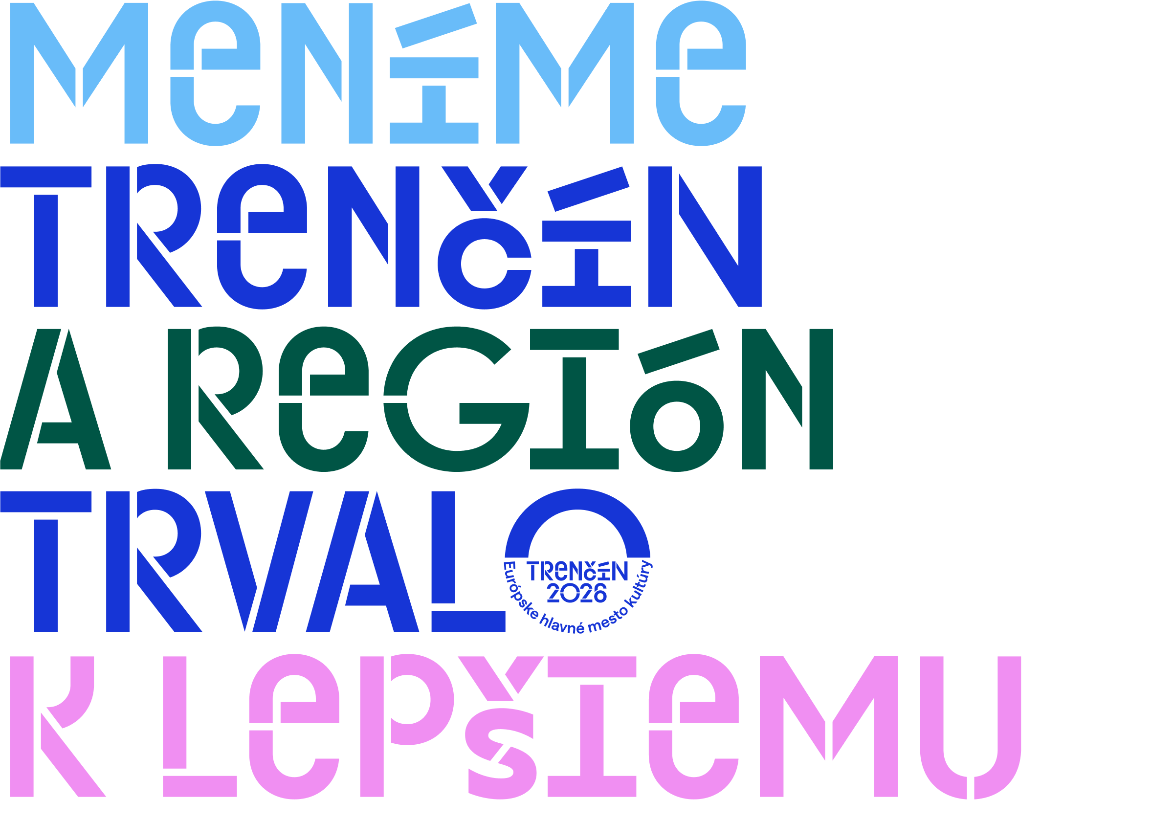
Cultivating curiosity is our universal catalyst for cultural change. Through culture, we strive to create genuine care, responsibility, concern and empathy for the world around us.
Our new visual identity helps us to communicate in a recognisable, consistent and memorable way with people in the city and the wider environment.
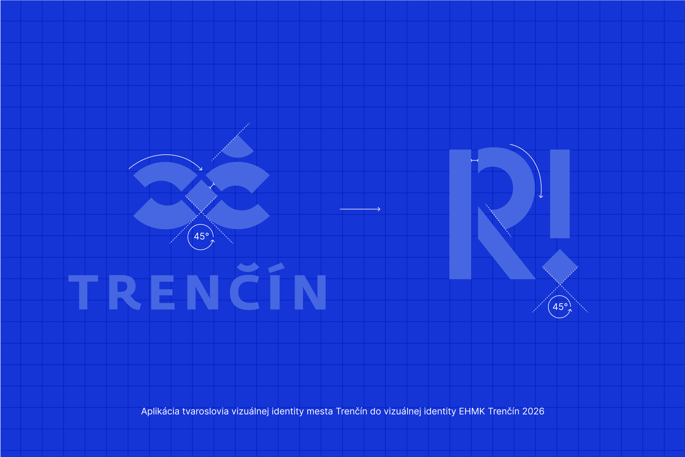
The aesthetics of the visual identity of the ECOC Trenčín 2026 is based on the morphology of the current visual identity of the city of Trenčín, which is a metaphorical reference to our work with the city, which we are rearranging, creating something new and thus improving it. The playfulness associated with this dimension of the visual identity in turn inspires curiosity, which is the main catalyst for the changes we are making in the city and the region. We inspire people to work with us to shape the city and region for the permanently better.
This manual serves as a guide for staff, external staff, partners and partner projects. Only by following this manual consistently can we achieve recognisable, memorable and consistent communication.
The manual is not an exhaustive answer to all questions and situations. However, it contains rules for working with the basic visual elements of the brand.
Like the brand, the manual itself needs to be regularly updated and adapted to new needs in order to fulfil its long-term function as a tool for creating new or adapting existing visual formats.
Accessibility in our designs ensures that our outputs are inclusive, useful to all, including people with visual impairments. Colour contrast is also a key aspect of accessibility. This manual provides guidance on ensuring that colour contrast meets WCAG 2.0 standards.
See more in the section „Colours“
In order to guarantee the highest possible level of readability for all, the following text settings should be taken into account:
Light contrast:The font should always be presented with good contrast against the background. This allows people with visual limitations, such as the elderly or those with colour blindness, to see and recognise characters better.
Clarity of shapes: The basic set of characters is designed to be uniquely identifiable and interchangeable. For maximum readability and accessibility for the largest possible audience, we recommend using the basic stylistic font set "Trencin Headline". Identification of shapes is also aided by adherence to minimum size, letterspacing and line size.
Sufficient space around the letters: Characters should not be too close together, but not too far apart either. This way we can guarantee maximum accessibility
See more in the section „Font“
Updated 2024/04/05
The elements of the brand are the basis of identity work. By using brand elements we can scale various applications of the ECOC Trenčín 2026 brand
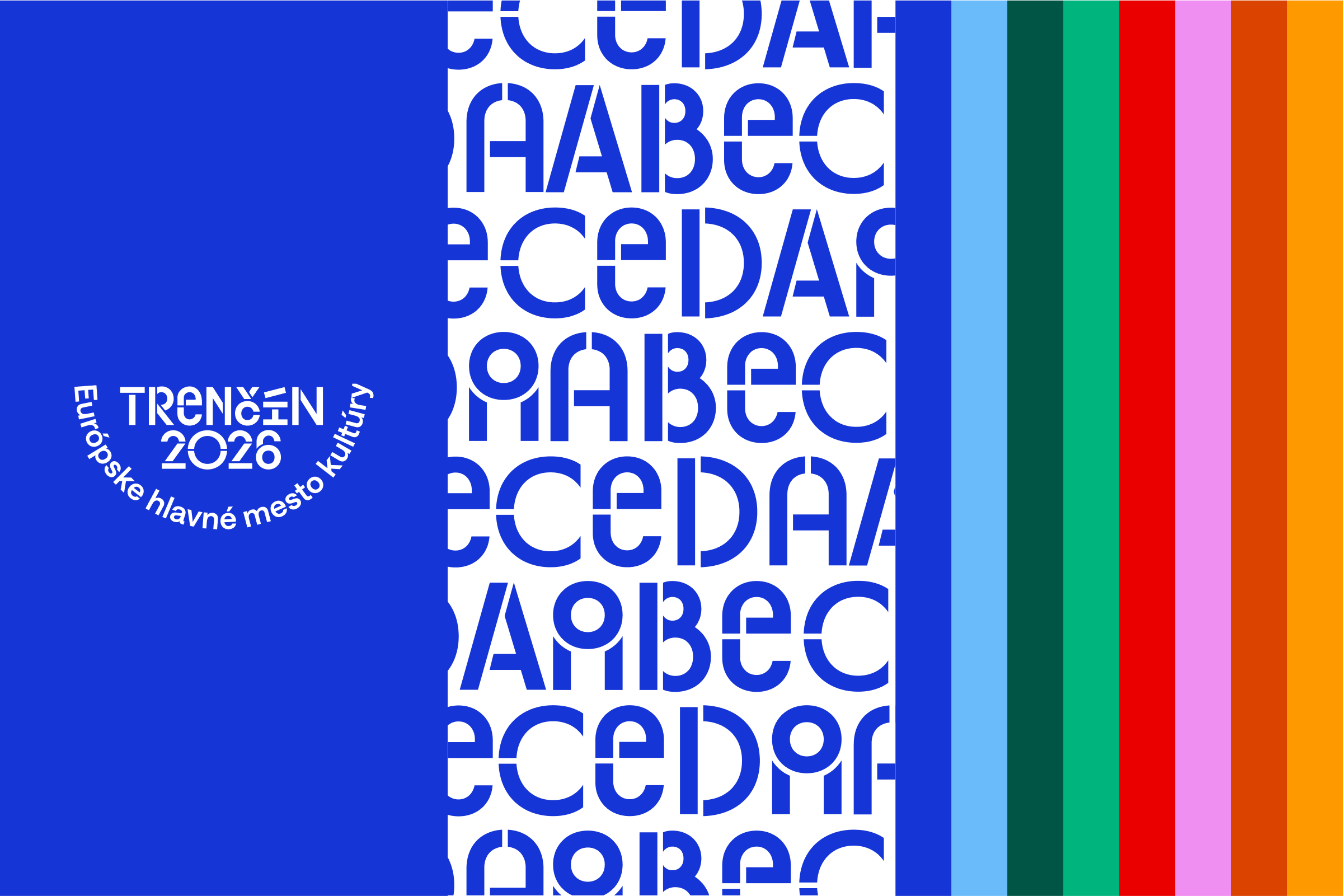
Trenčín 2026 has its own unique identity, which is characterised by visual elements such as the logo, fonts and colours. These elements are not just aesthetic additions – they are the cornerstones that define how we perceive a brand, how it communicates its values and how it differentiates itself from the competition.
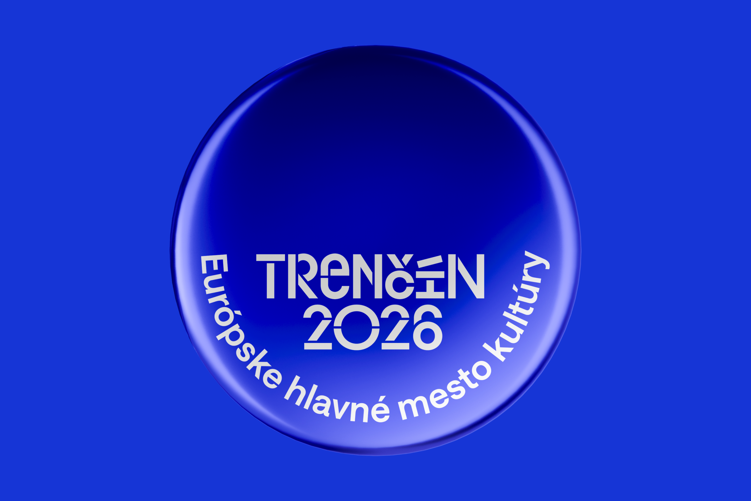
Logo – a fundamental element of visual identity. By default, we use the primary version. In marginal cases, alternatives of the logo. Such as a one-line logo or a logo in English. More information can be found in the Logo section.
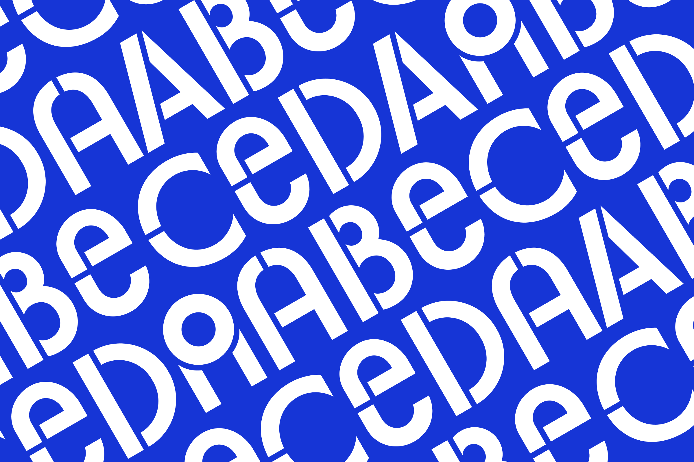
Font – one of the basic distinguishing features of the identity of the ECOC Trenčín 2026. It is designed as a distinctive visual element distinguishing the communication from the competition. At the same time, it unifies the communication of diverse projects under the roof of the ECOC Trenčín 2026. More information can be found in the Font section.

The colour palette of the ECOC Trenčín 2026 works with the primary blue colour. We also work with multi-coloured themes or themes based on prescribed colour pairs. More information can be found in the Colours section.
Updated 2024/04/05
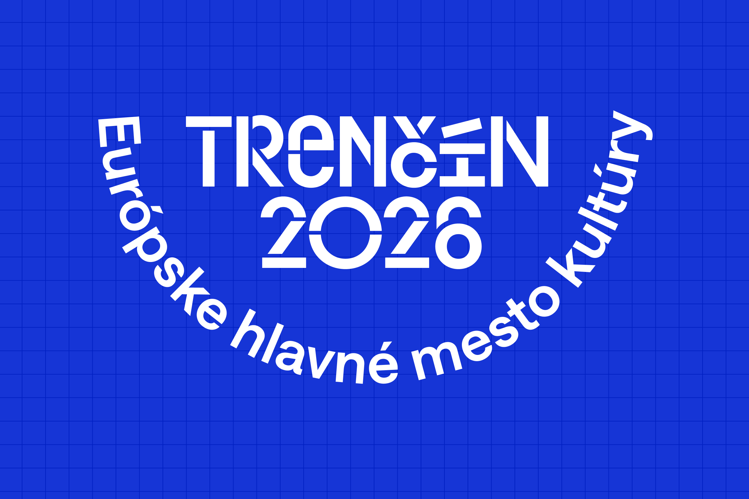
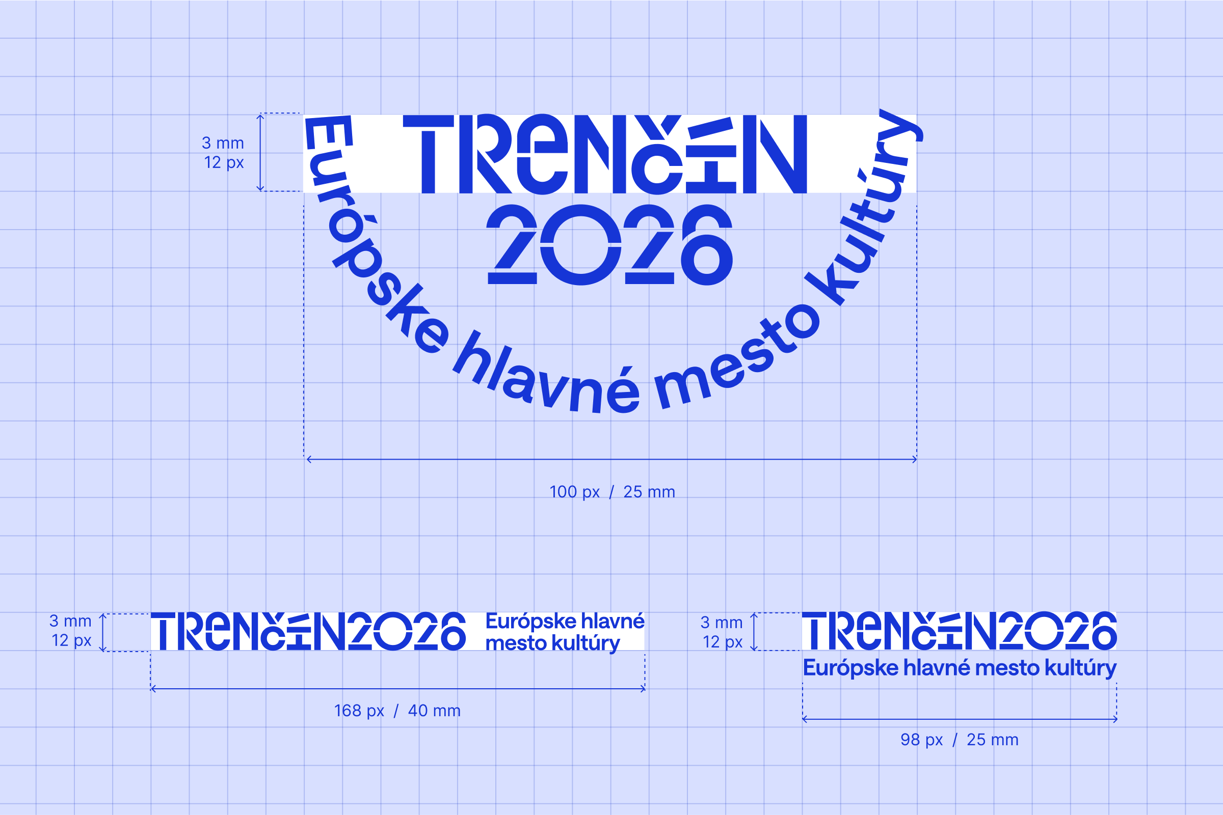
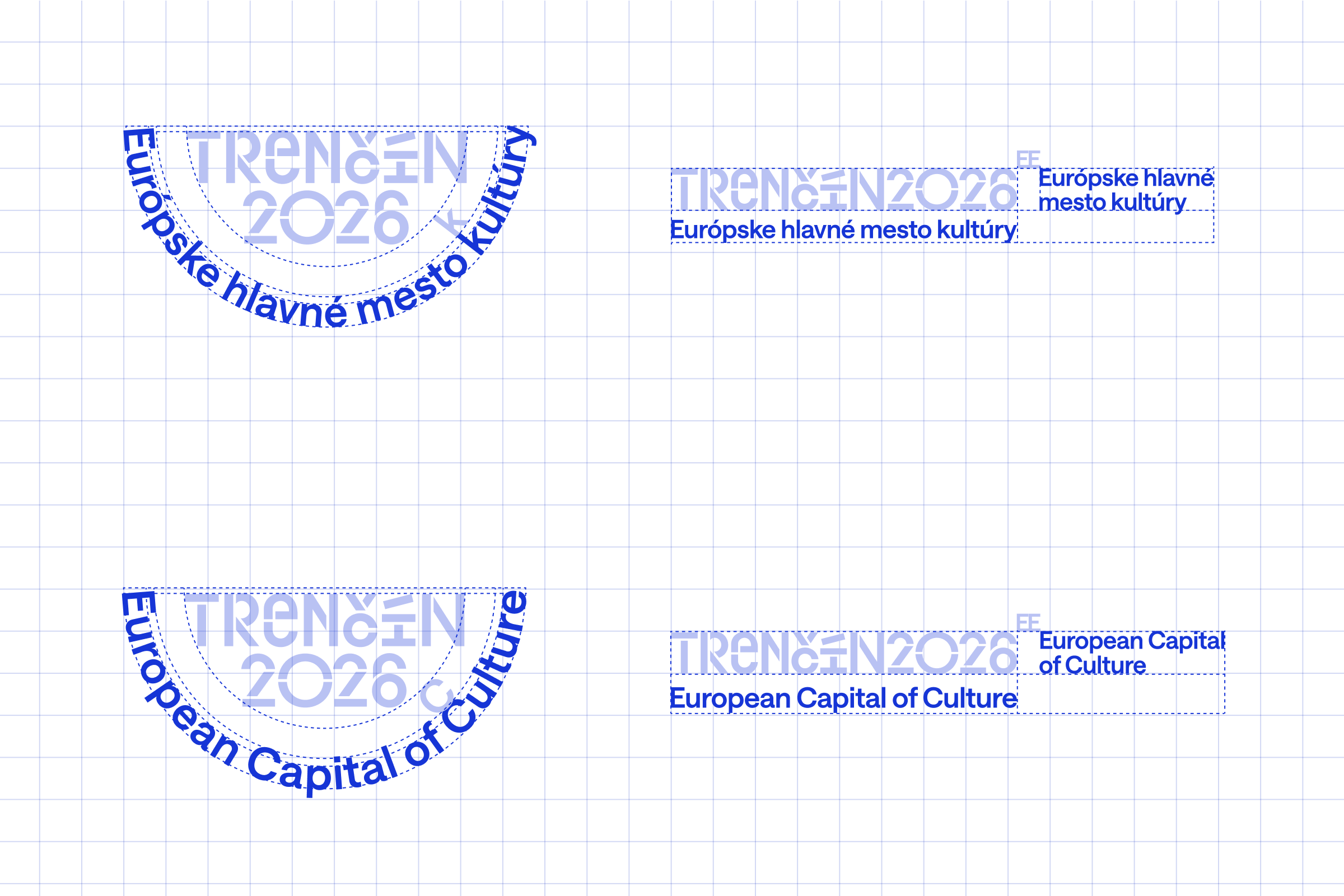
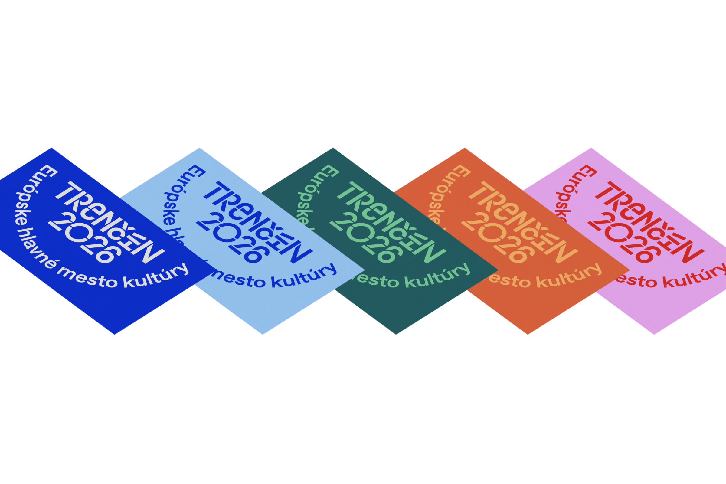
The basic variant of the logo is a semicircular logo with the global description "European Capital of Culture". For guidance on how to work with it, see the section Logo application.
In the international context, we work with the English version of the logo with the description "European Capital of Culture".
In rare cases, we use the logo without a description. More in the section Logo application
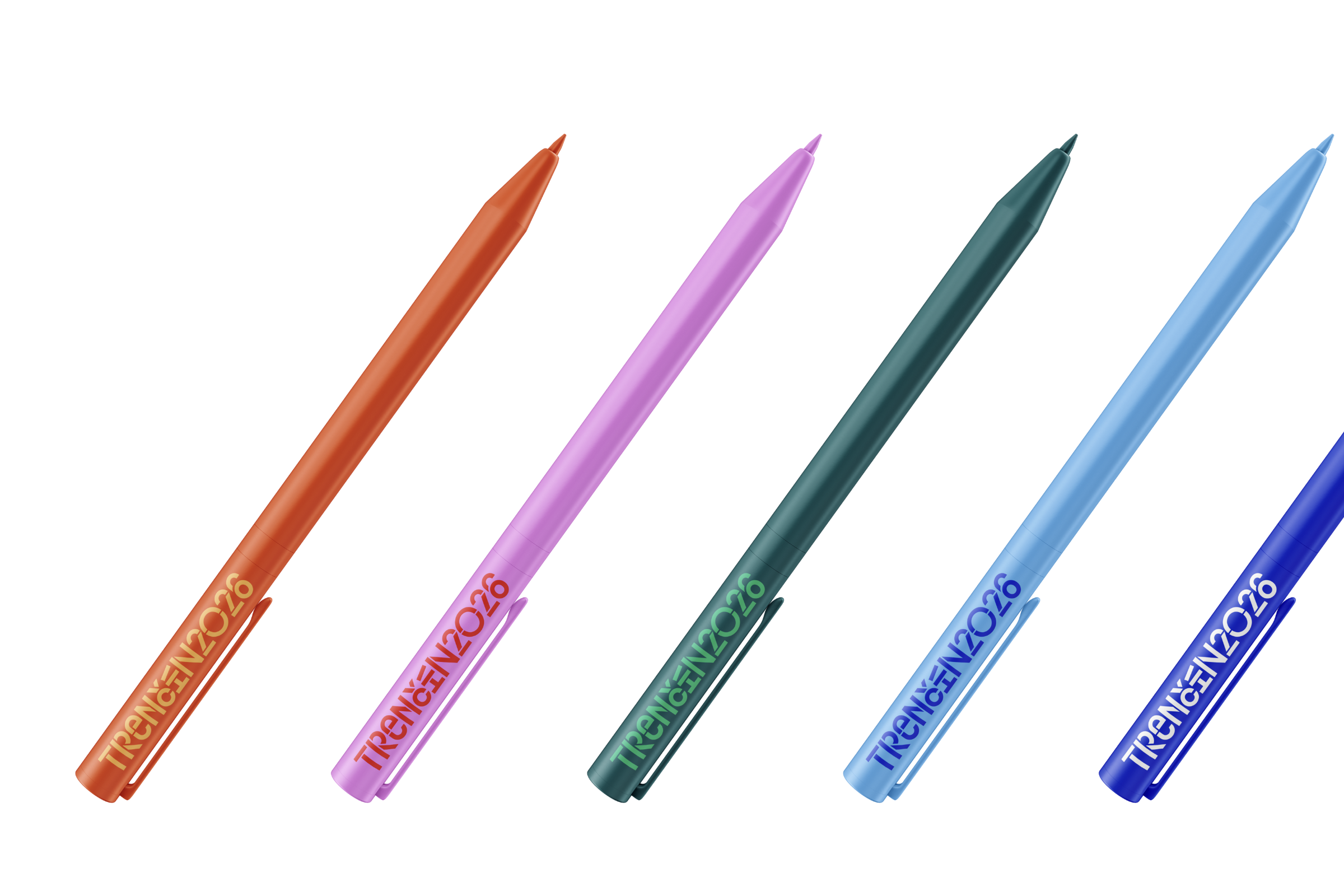
In most cases we work with a basic logo with a semicircular description "European Capital of Culture". In international communication we work with the English version of the logo with the description "European Capital of Culture". In marginal cases for large (e.g. a sign in a park) or too small applications (e.g. a pen) we can use a typographic version without the logo description.
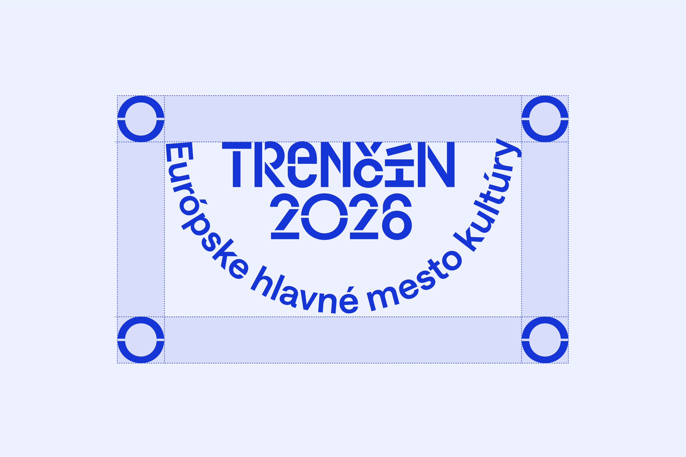
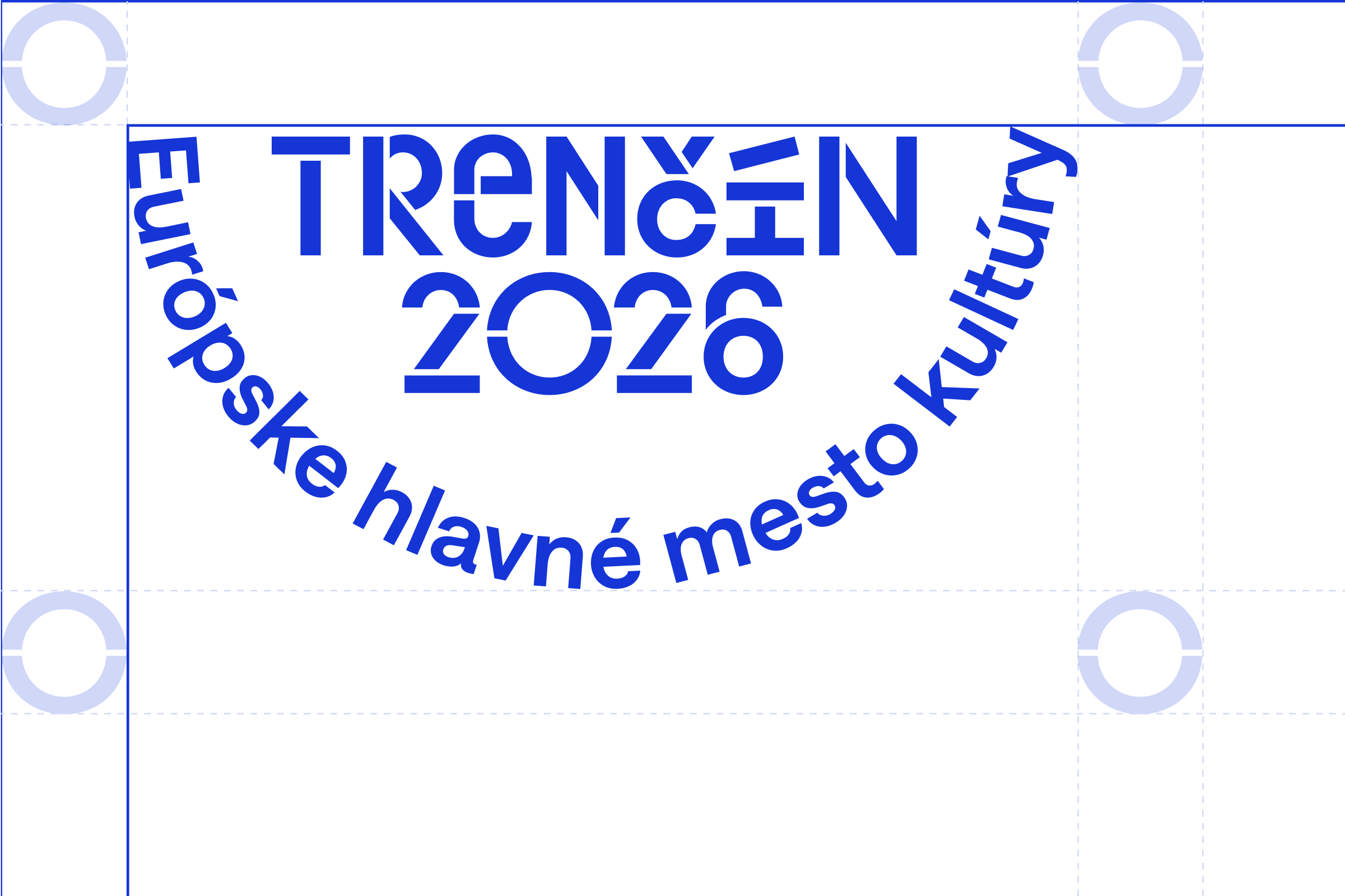
The logo safe zone helps us to ensure safe logo recognition.
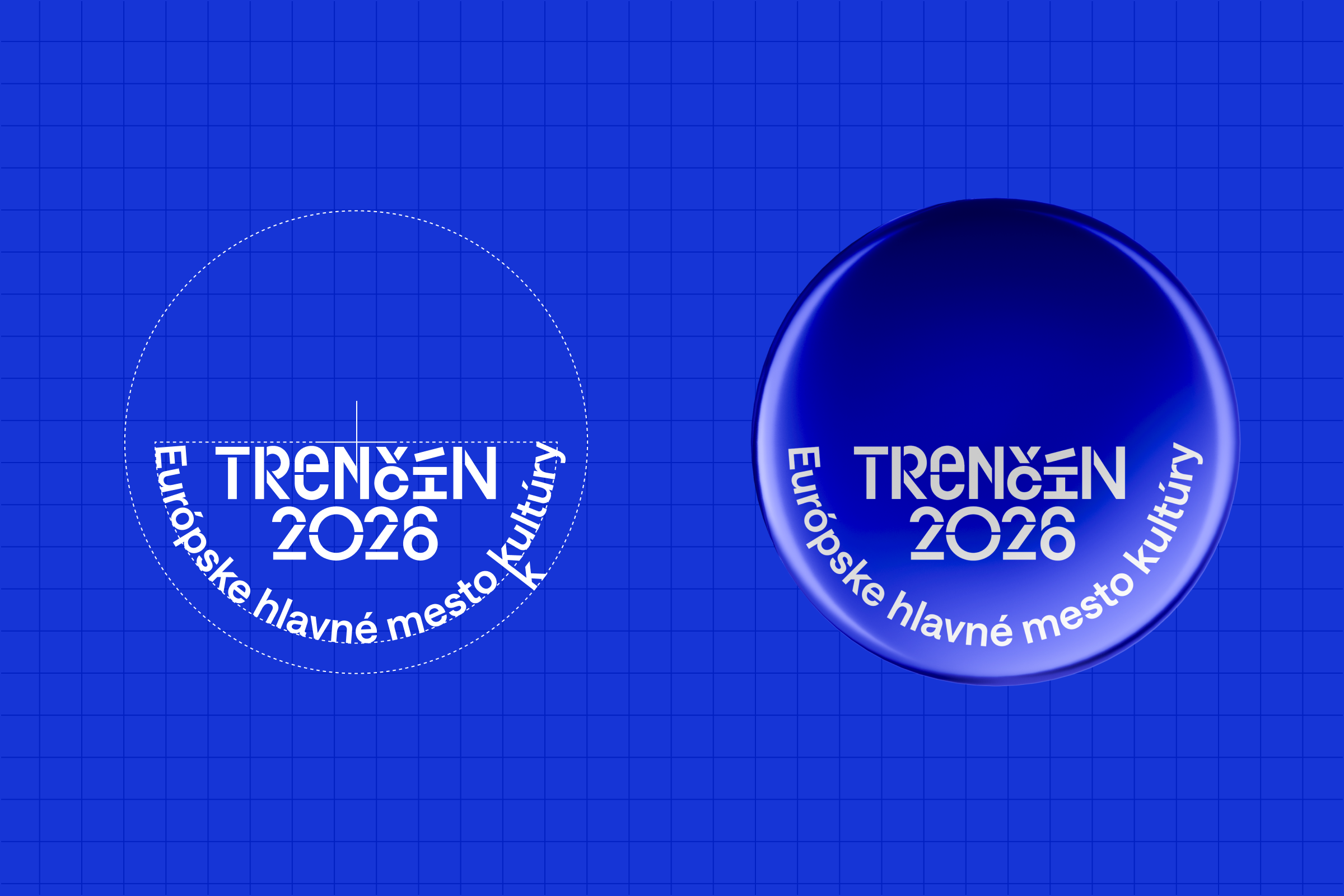
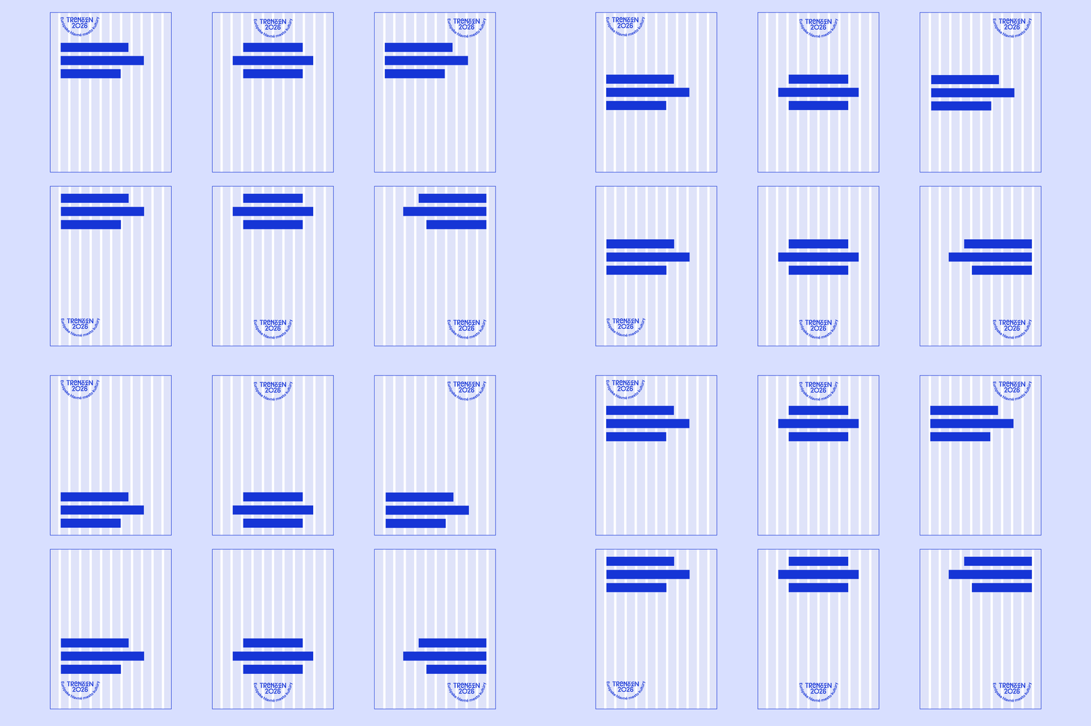
Example of logo alignments:
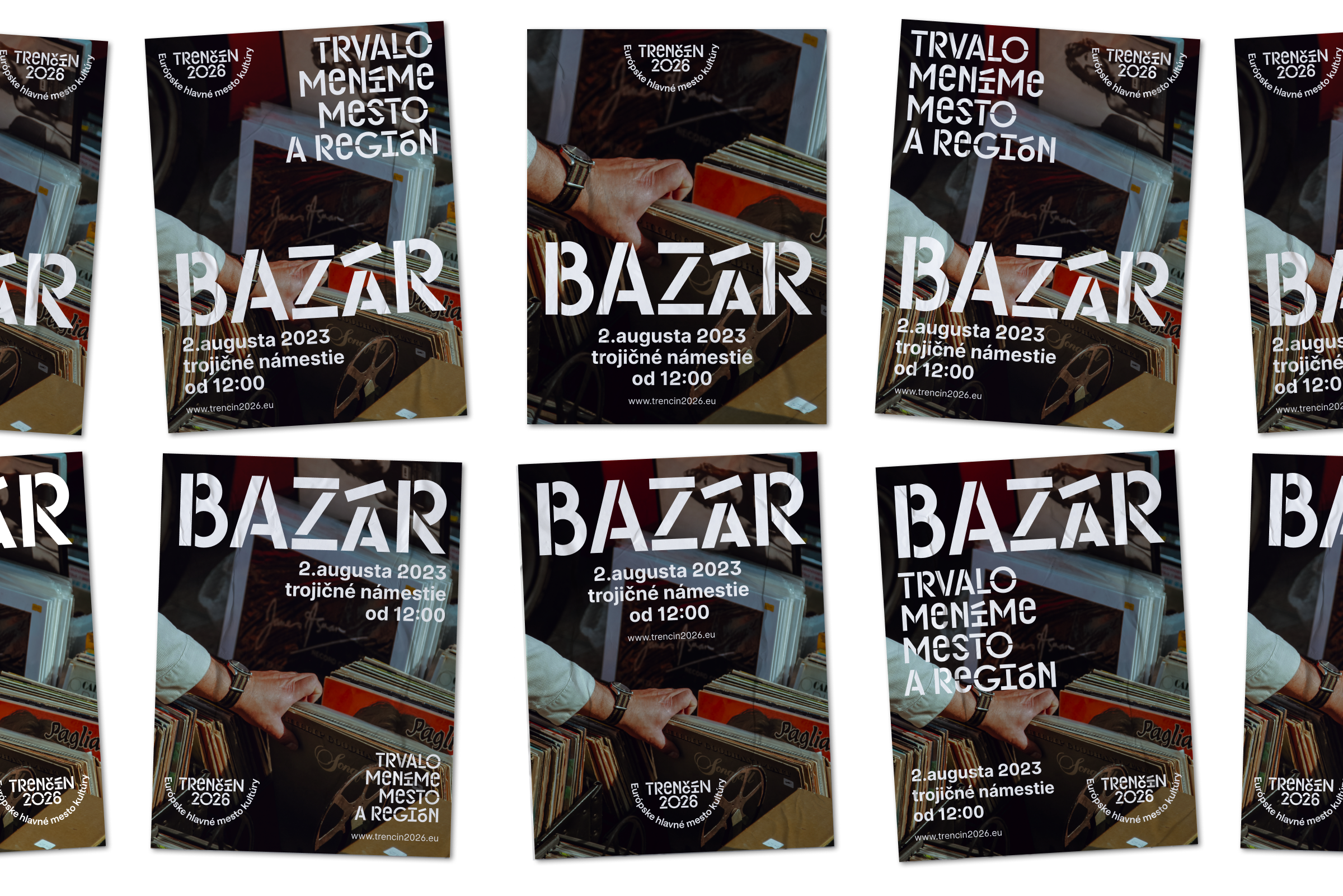
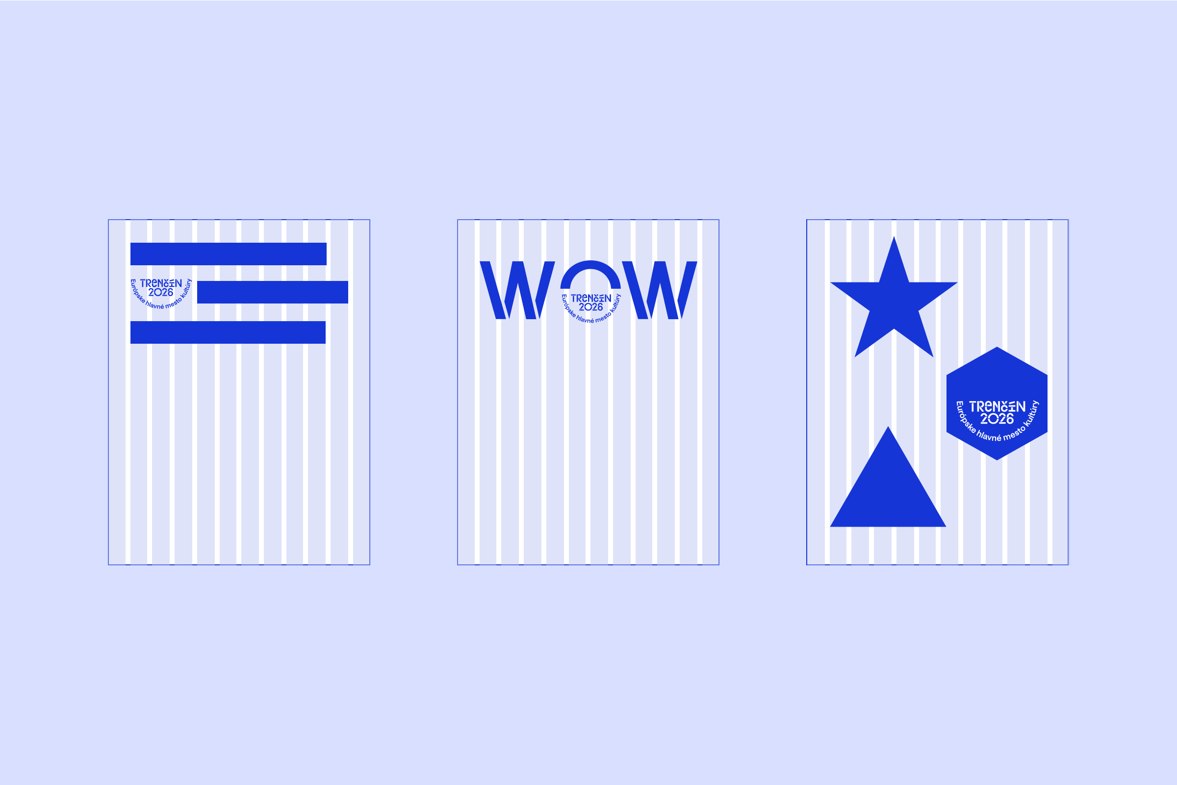
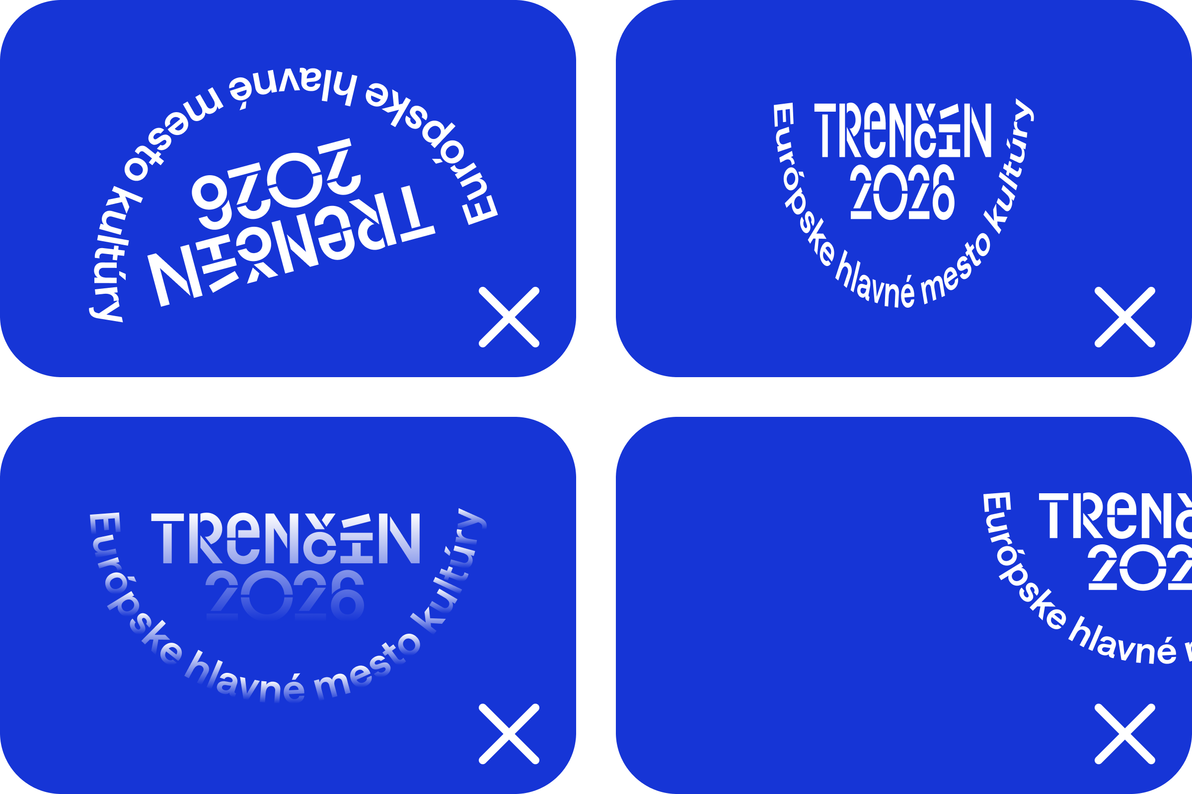
In some situations, we can also place the logo in a creative way to make it a bigger part of the visual:
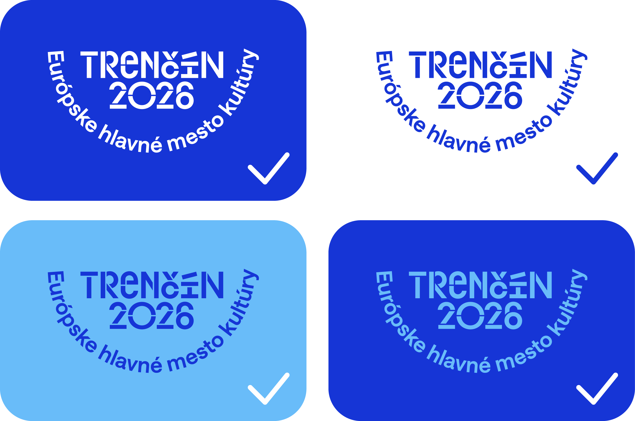
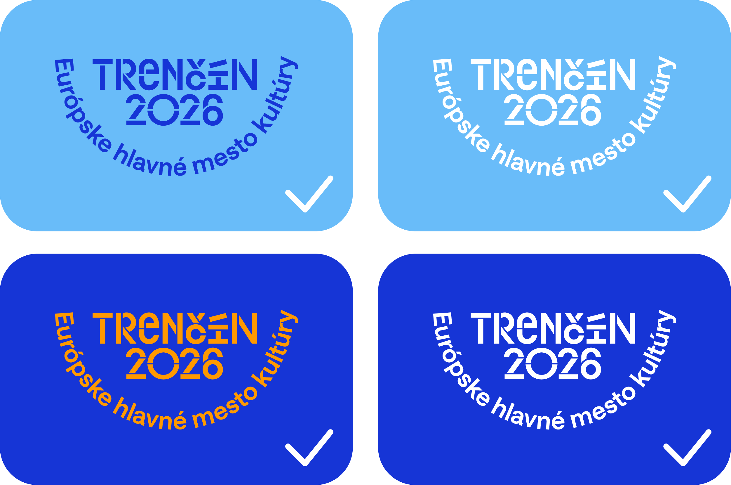
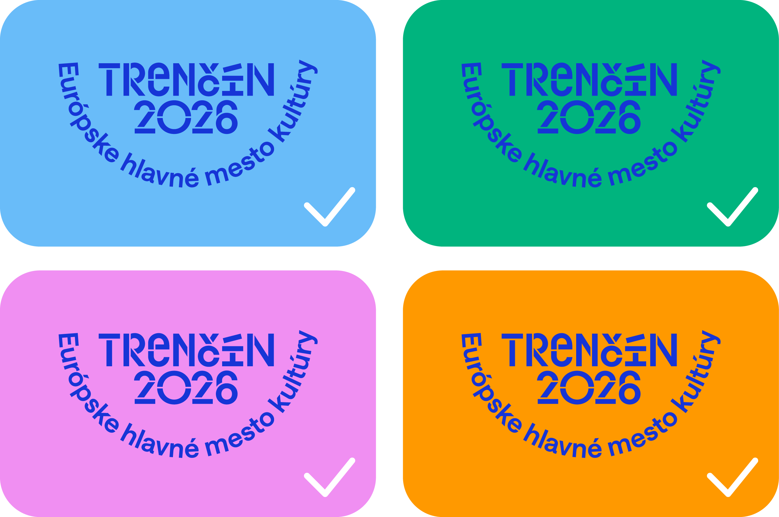
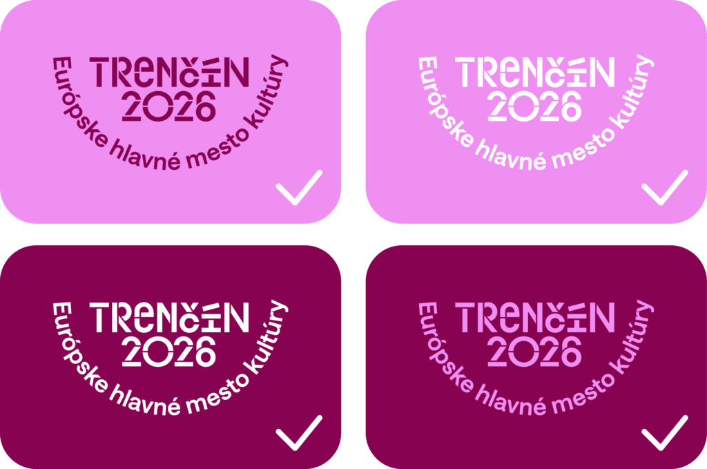
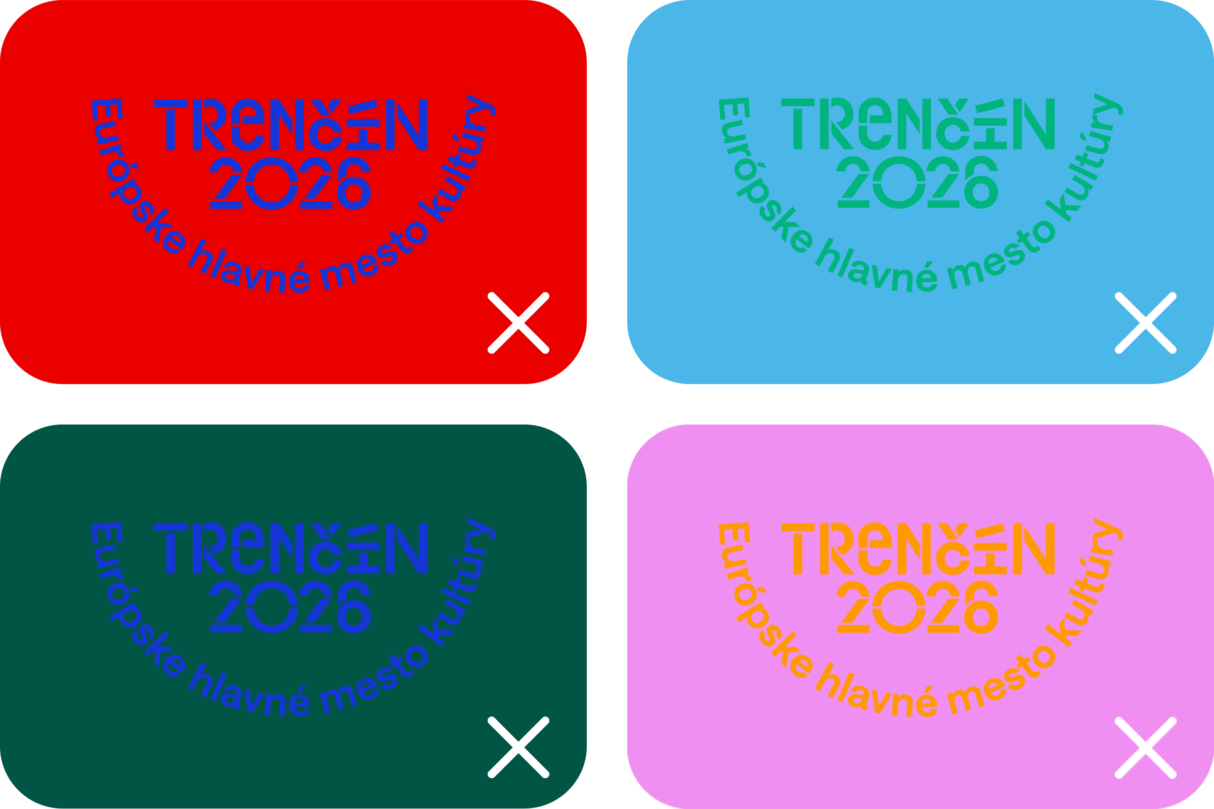
When using the logo of the ECOC Trenčín 2026, it is important to observe the colour theme of the application, sufficient contrast and legibility of the logo. The appropriate size of the logo should not be forgotten.
When applying the logo it is important to respect the colour theme in which the logo is applied. In cases where this is not possible we can use dark blue, white or in black and white applications black logo.
When applying the logo, we always check that the contrast of the logo with the background is sufficient, but also in the context of the entire layout. It is important that the logo does not disappear in the layout, but that it does not shout out if it is not desired.
Pre dobrú čitateľnosť nasledujme pravidlá týkajúce sa minimálnej veľkosti loga.
Updated 2024/04/05
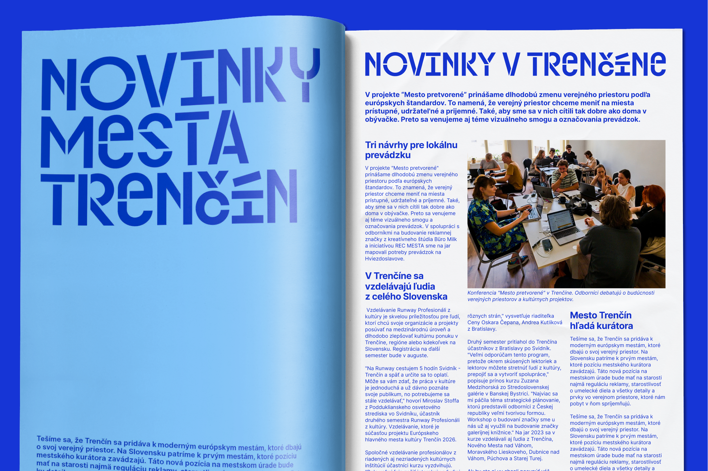
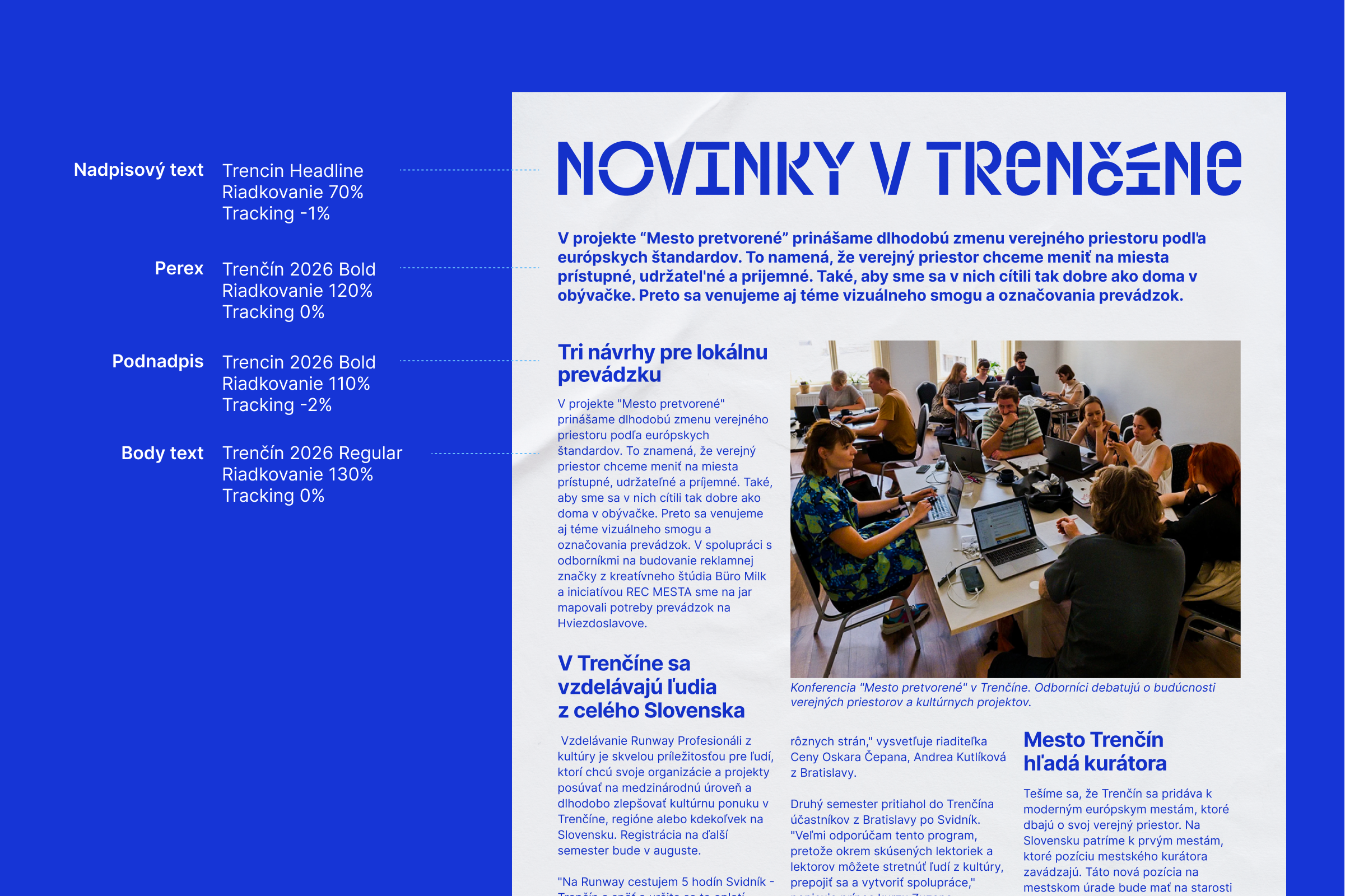
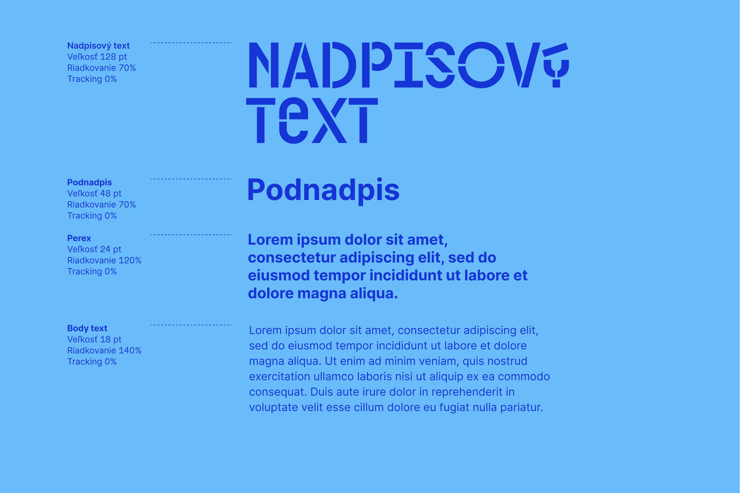
The typography of the ECOC Trenčín 2026 is a basic and distinctive component of the visual identity. We use:
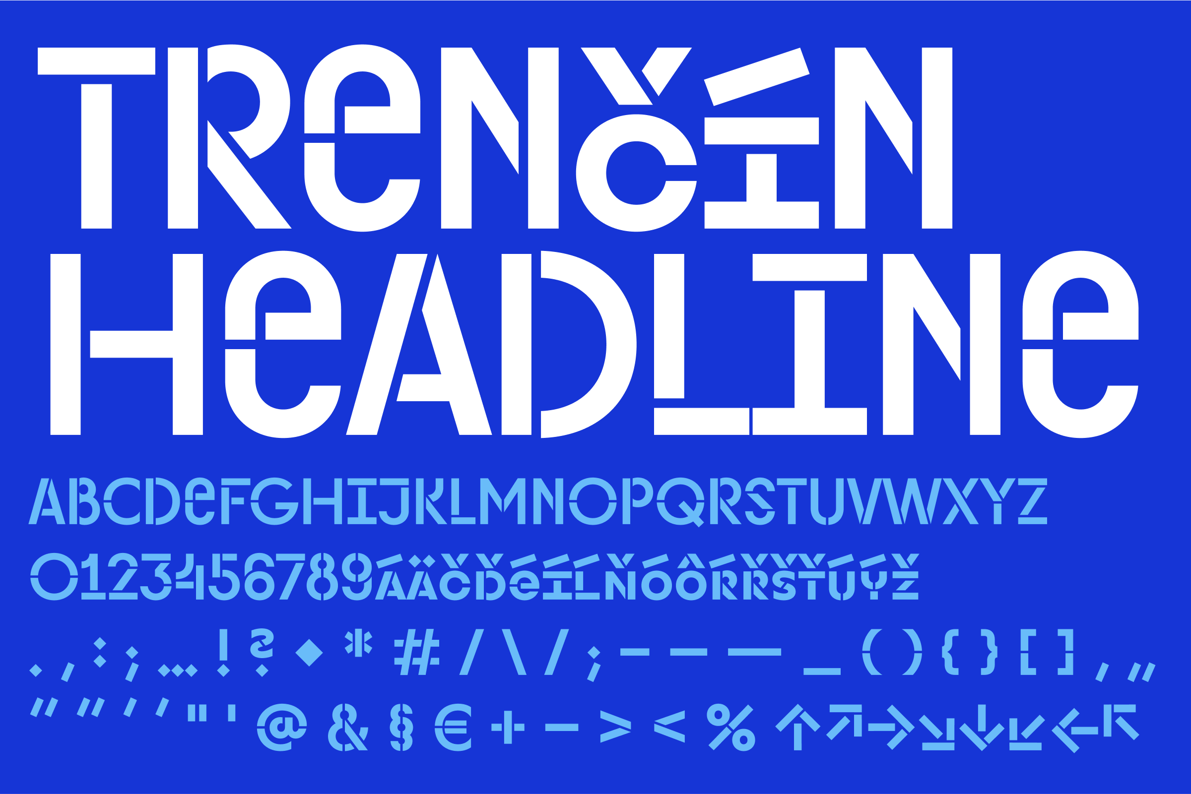
We use it for the main headlines
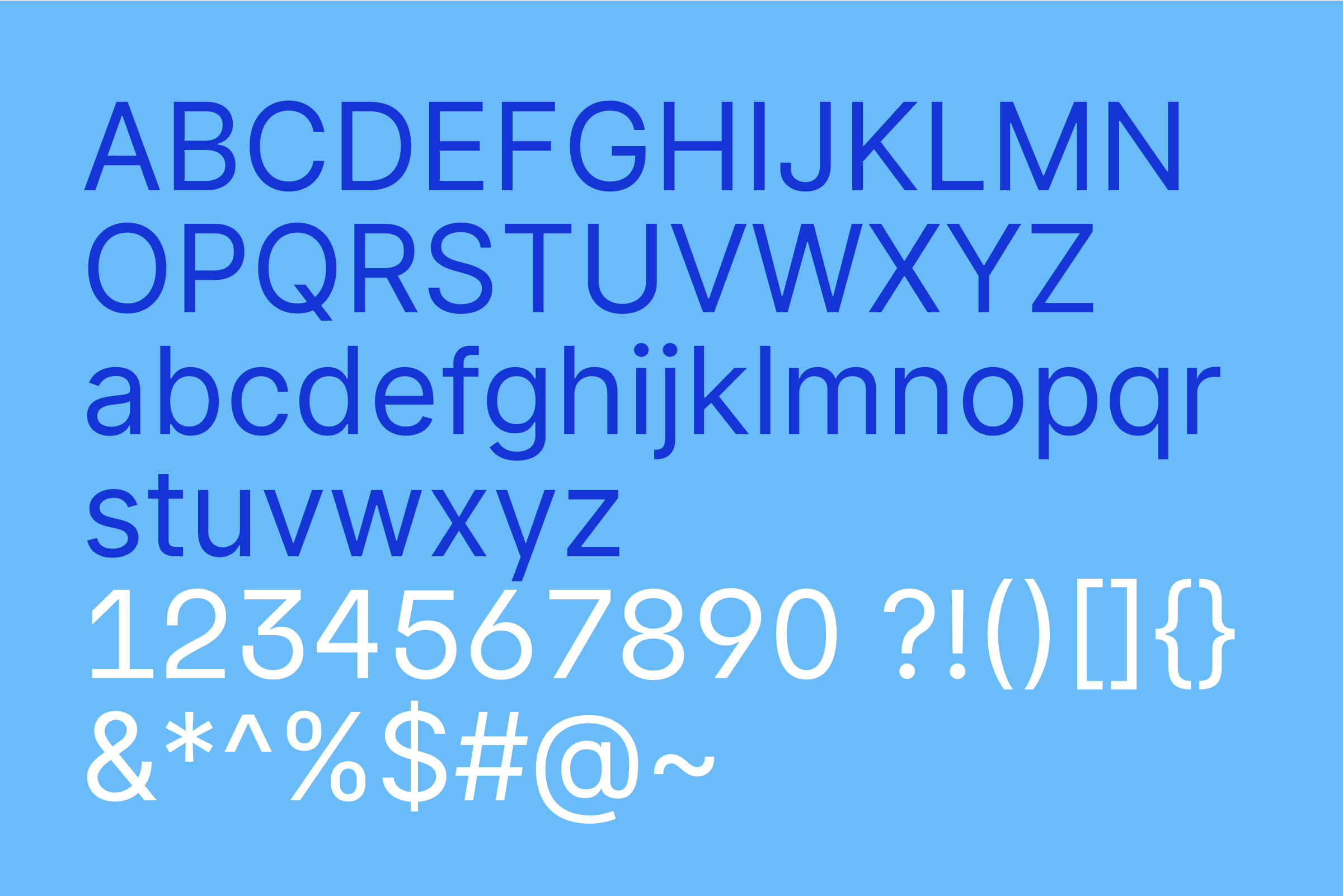
For text and content information
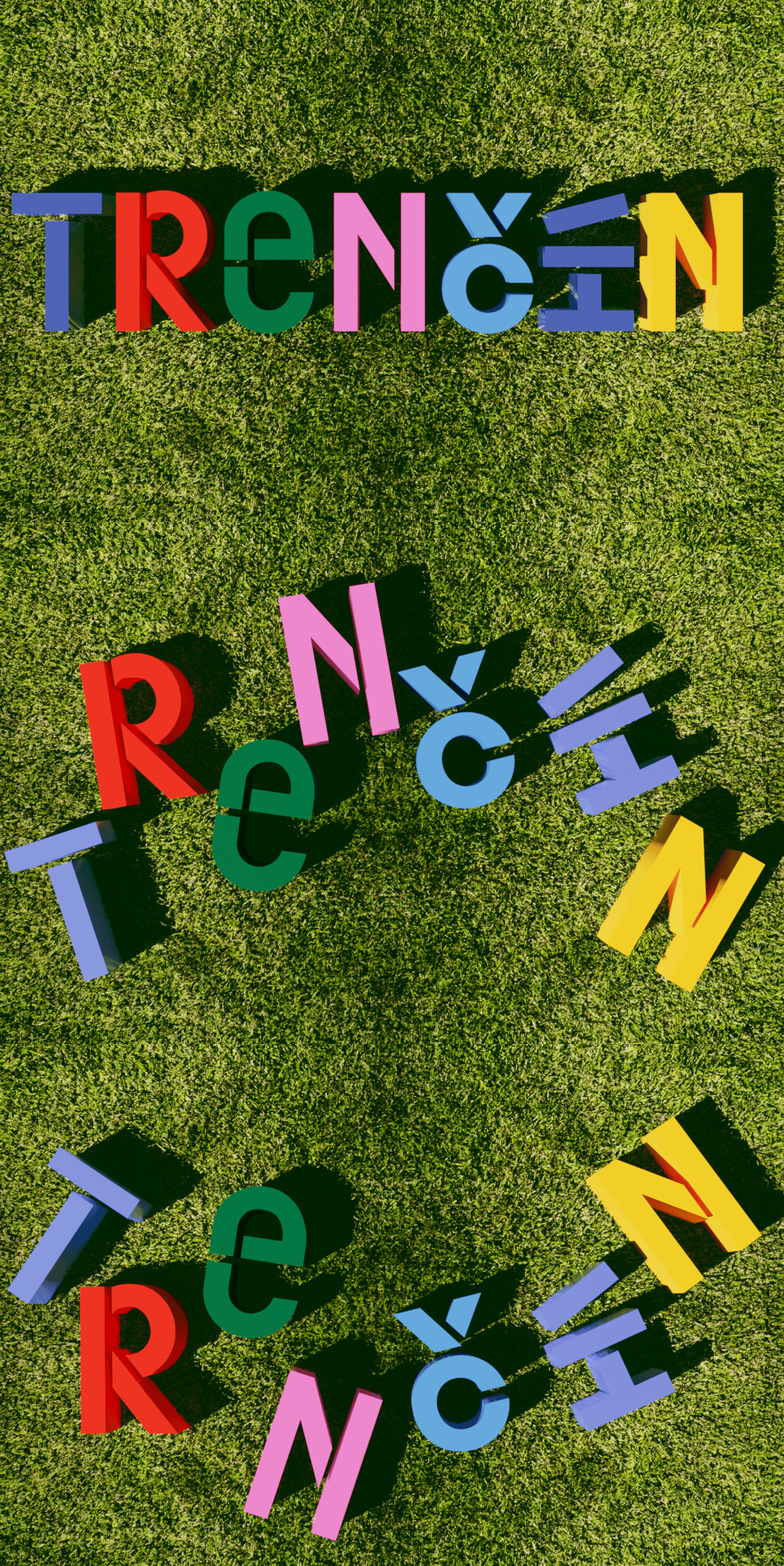
The font Trenčín Headline is the basic building and distinguishing element of the brand.

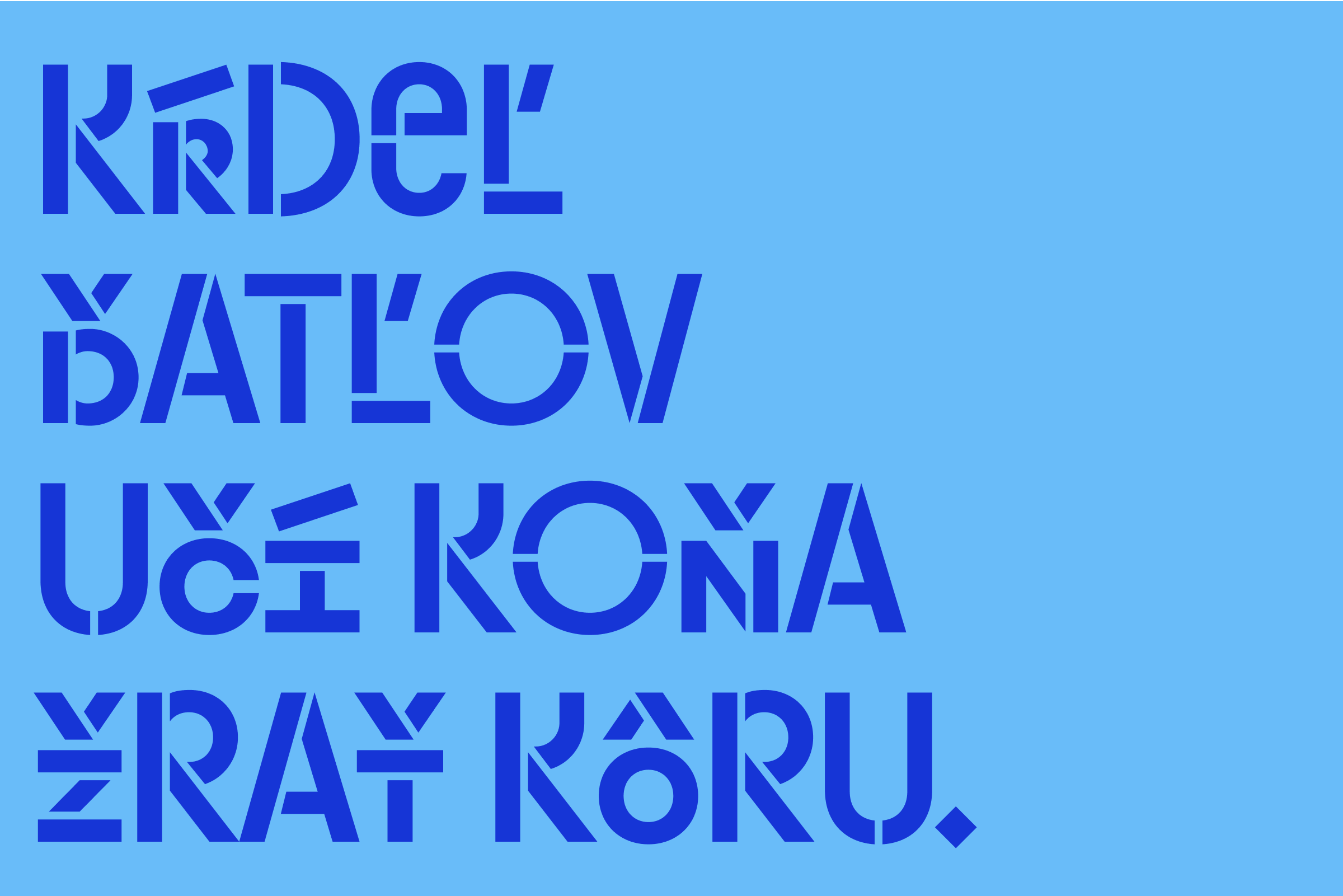
In order to guarantee the highest possible level of readability for all, the following text settings should be taken into account:
Light contrast:The font should always be presented with good contrast against the background. This allows people with visual limitations, such as the elderly or those with colour blindness, to see and recognise characters better.
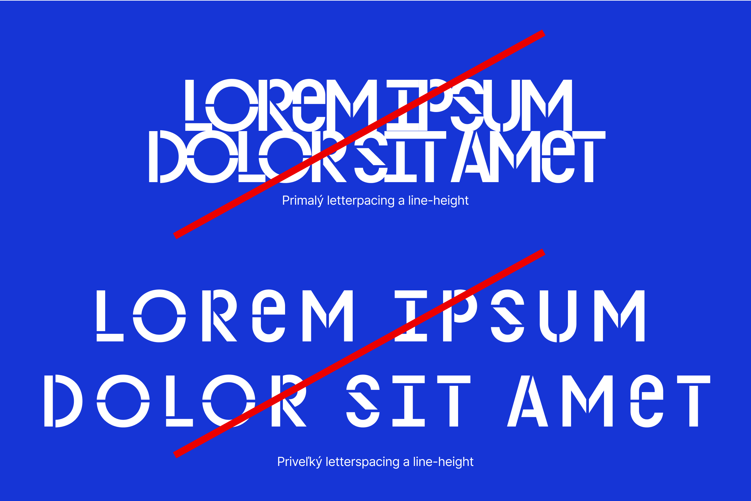
Clarity of shapes: The basic set of characters is designed to be uniquely identifiable and interchangeable. For maximum readability and accessibility for the largest possible audience, we recommend using the basic stylistic font set "Trencin Headline". Identification of shapes is also aided by adherence to minimum size, letterspacing and line size.
Sufficient space around the letters: Characters should not be too close together, but not too far apart either. This way we can guarantee maximum accessibility
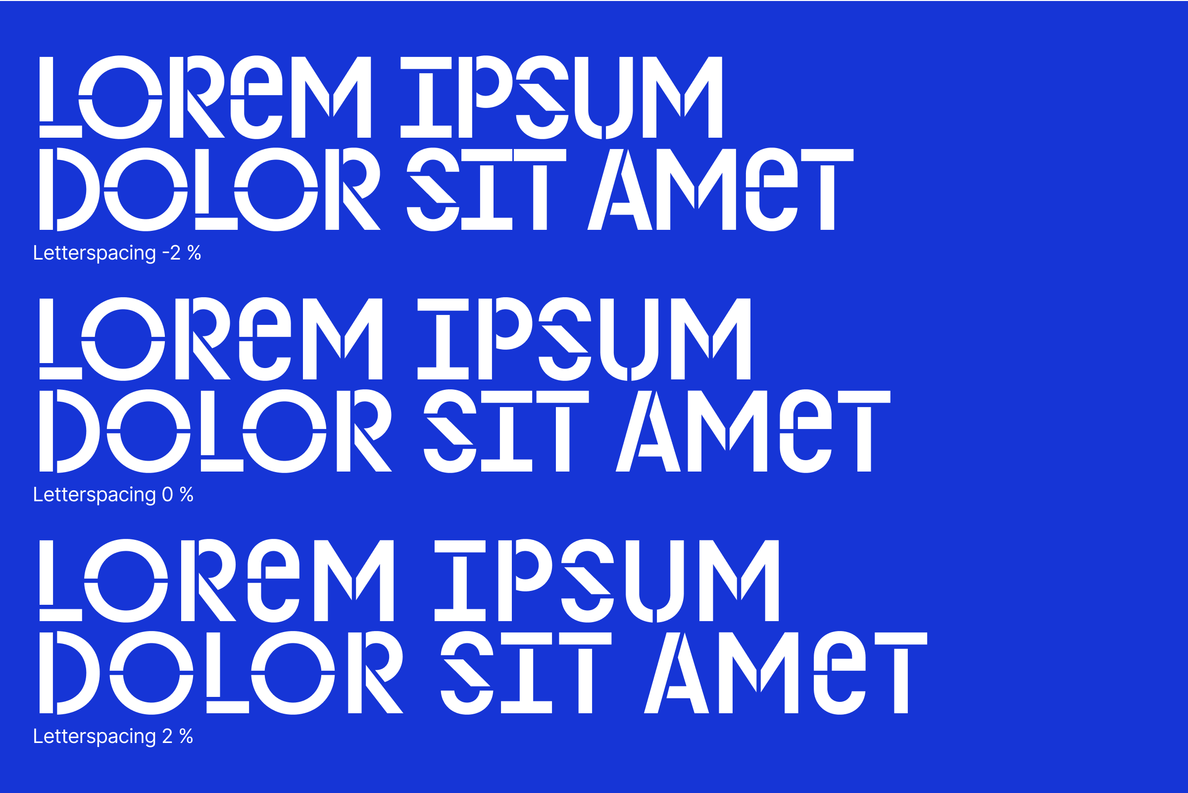
The Trenčín Headline font is designed as a headline font for use in larger sizes to guarantee the necessary distinctiveness, recognizability and uniqueness of the Trenčín ECOC 2026 brand.
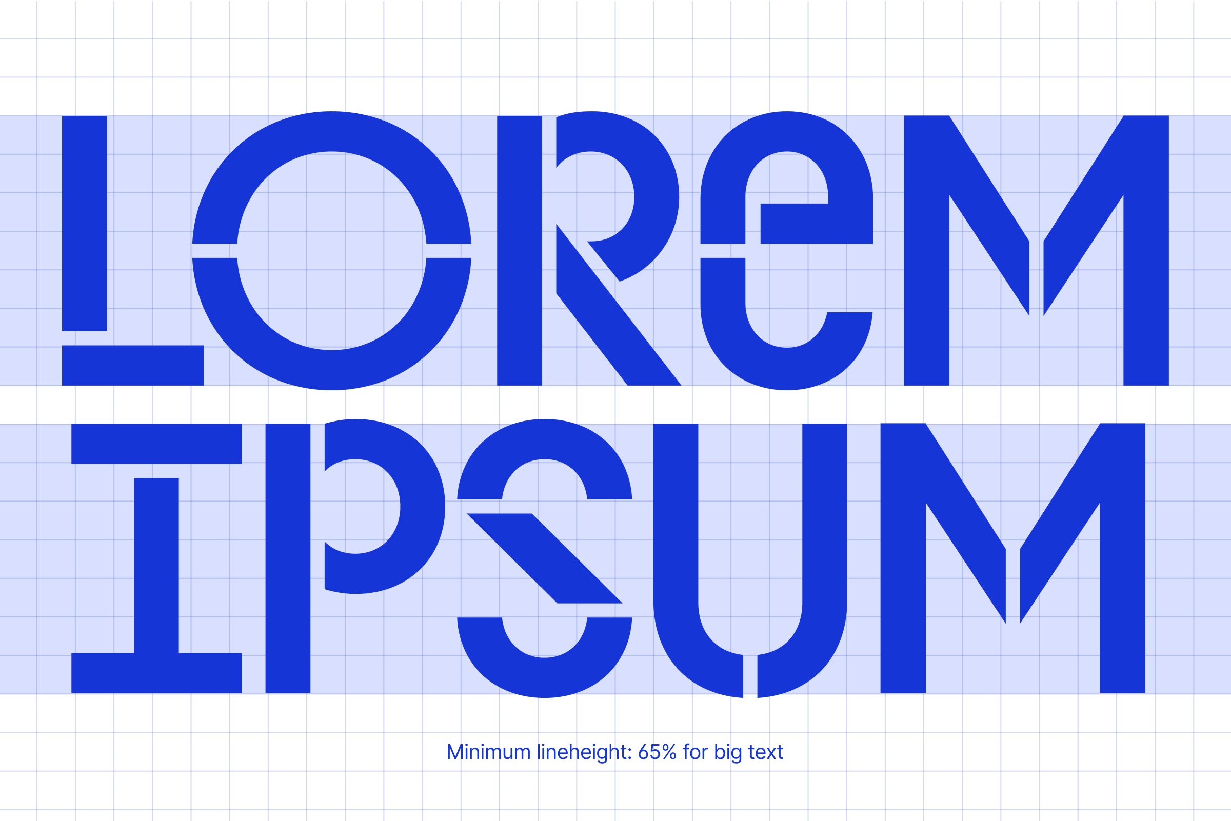
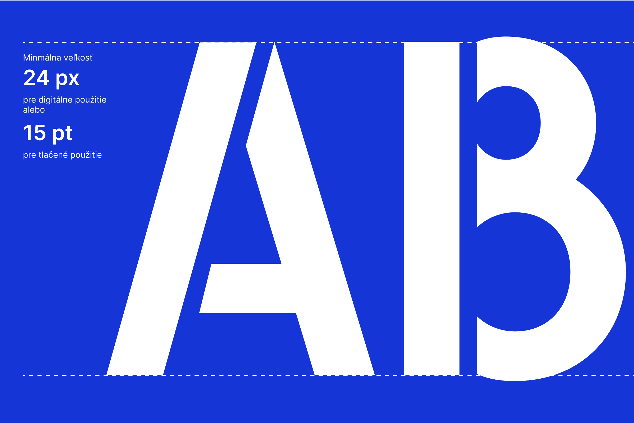
Minimum text size is 24 px for digital or 15 pt for print.
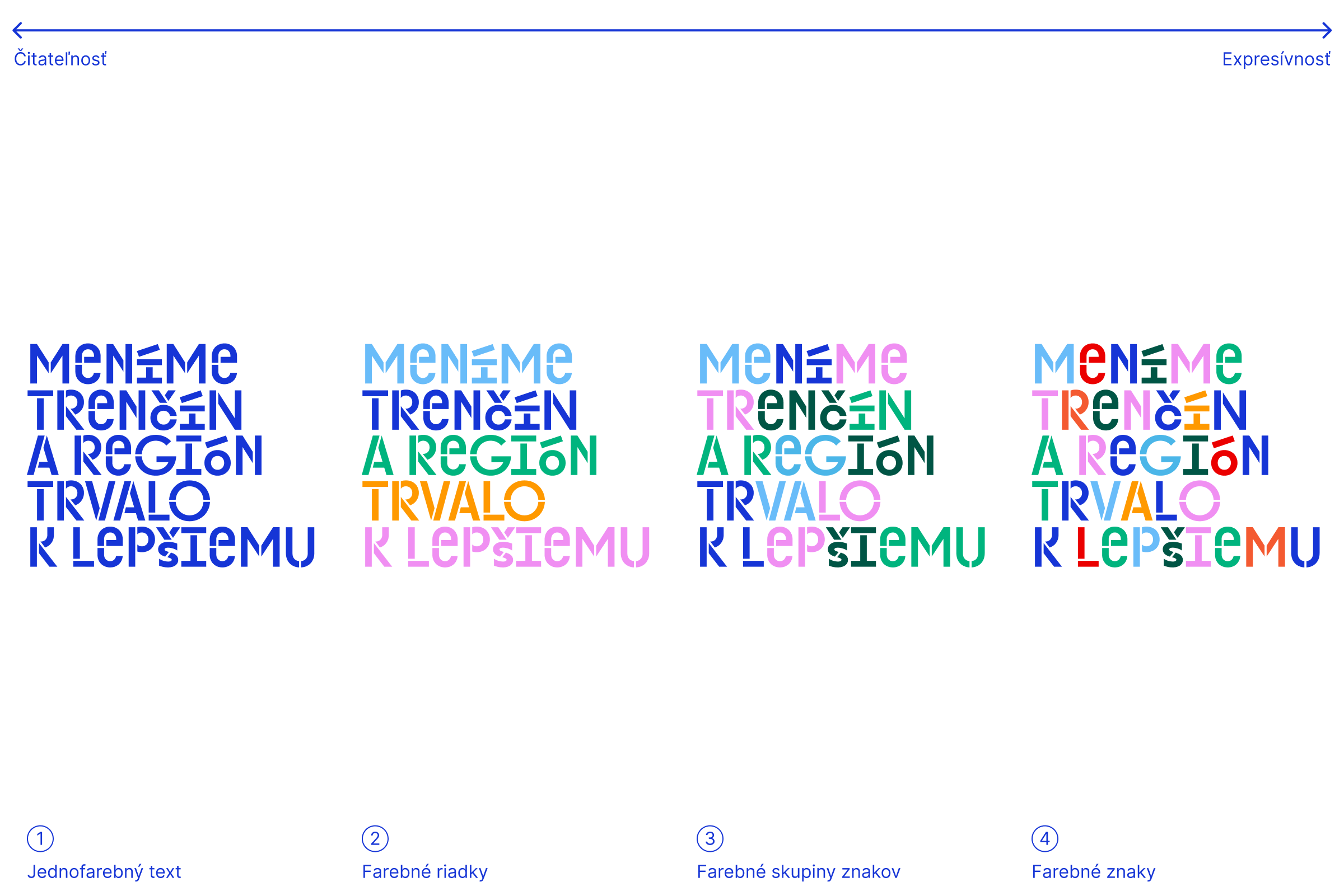
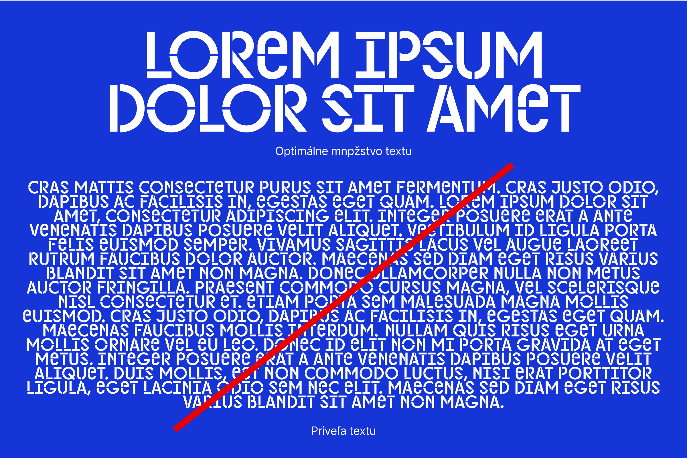
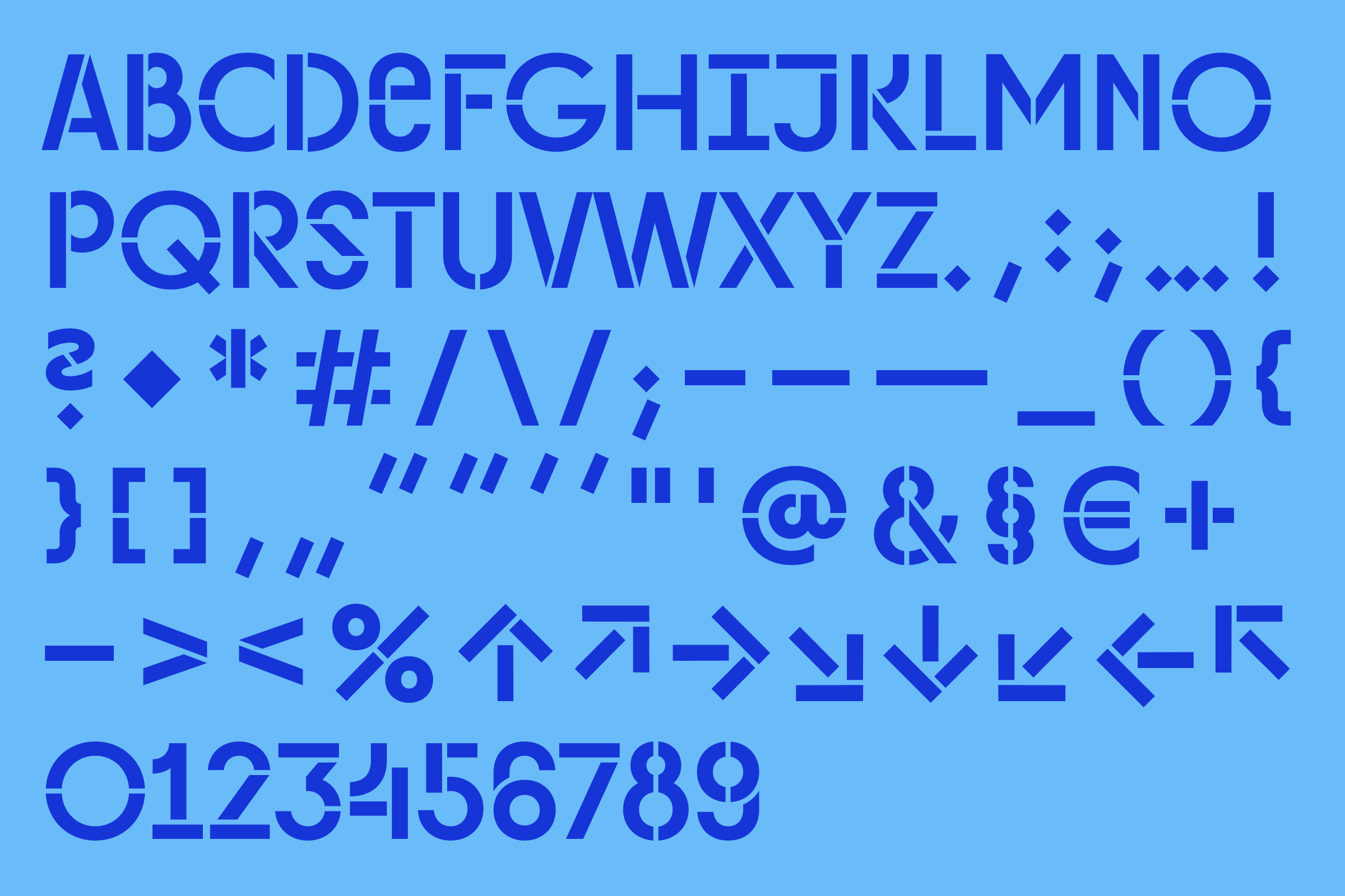
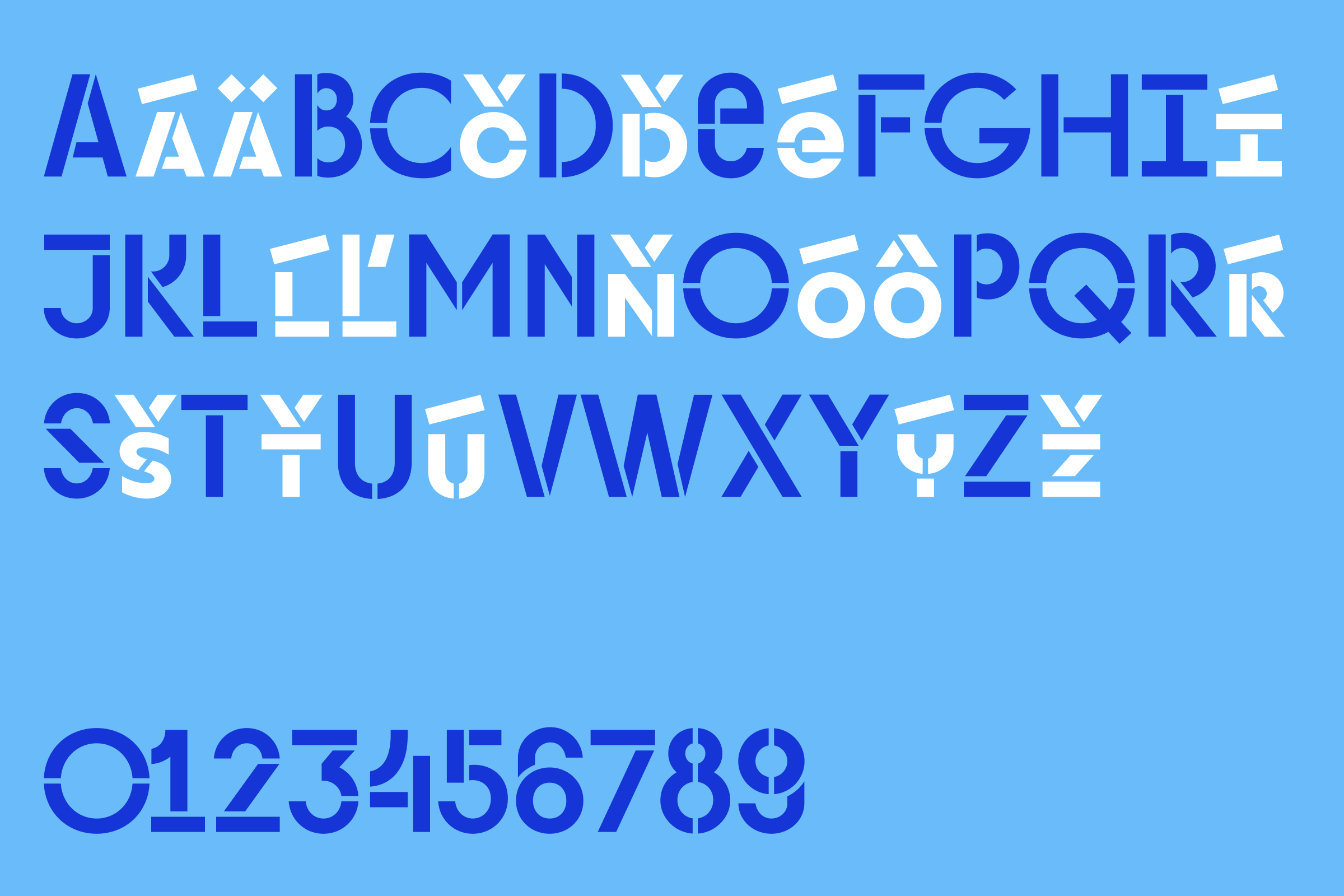
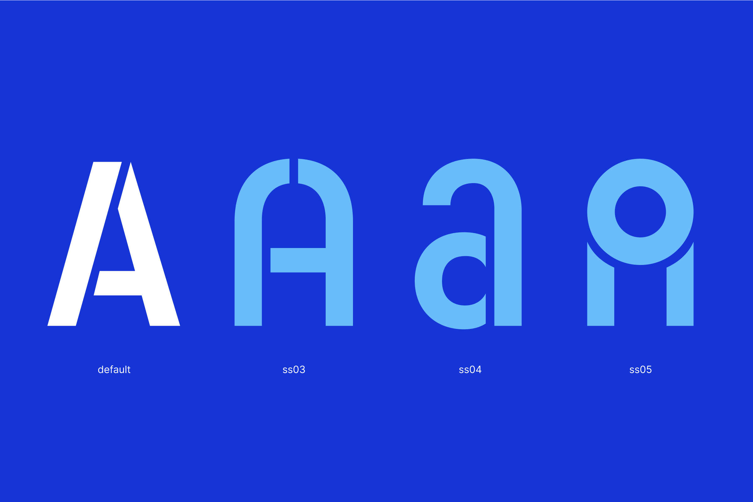
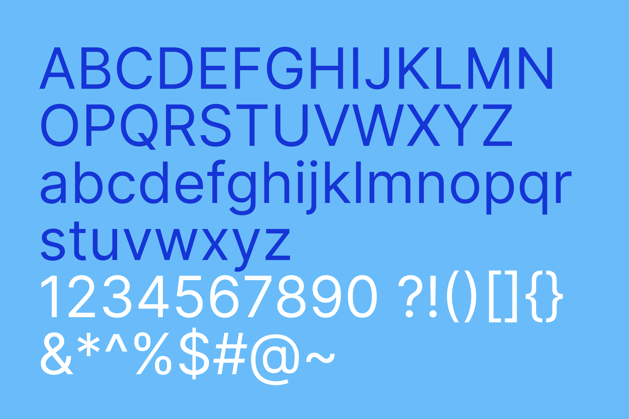
The basic text font is called Trenčín2026 and is created by Matej Pyšný based on the open source font Inter designed by Rasmus Andersson.

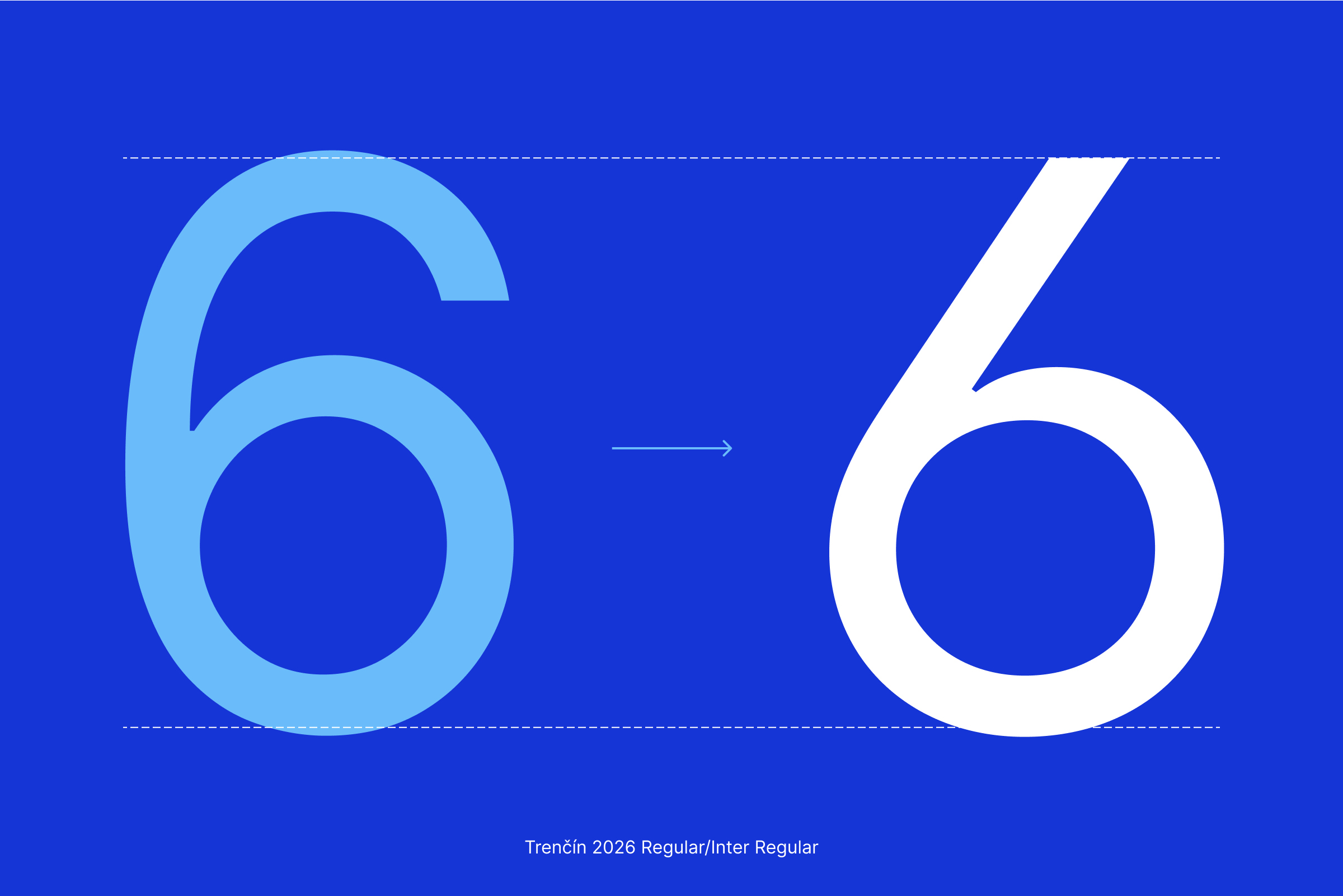
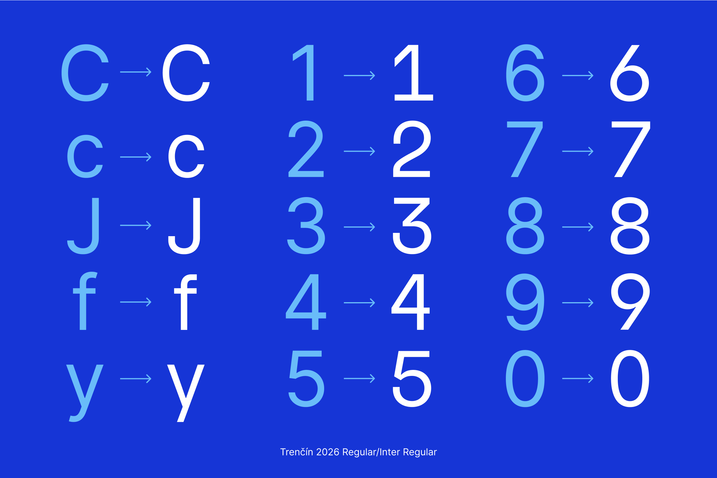

The most suitable system font is Inter:
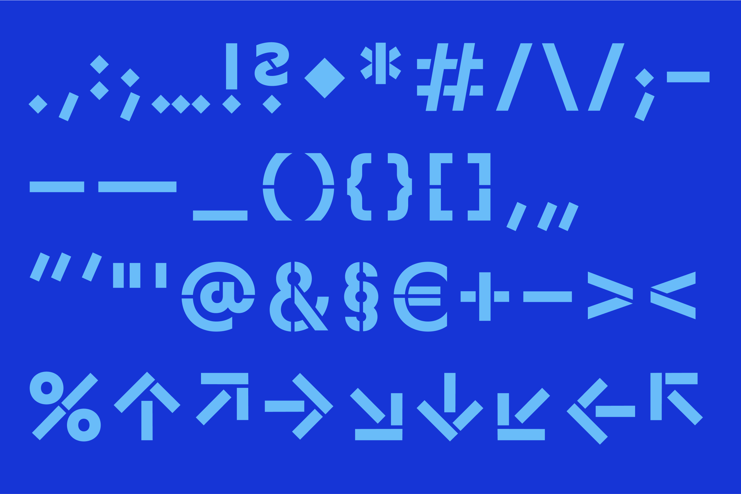
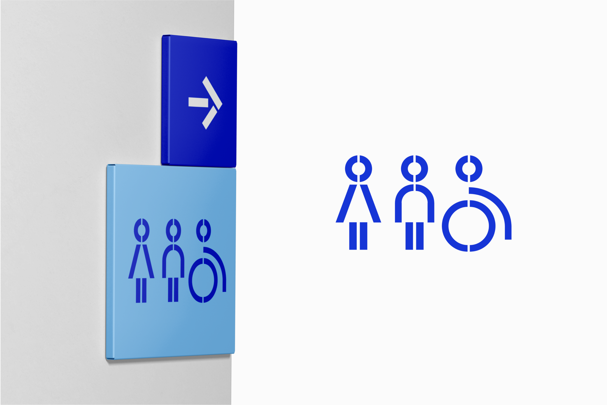
A sample of the visuality and aesthetics of the icons designed for Trenčín 2026
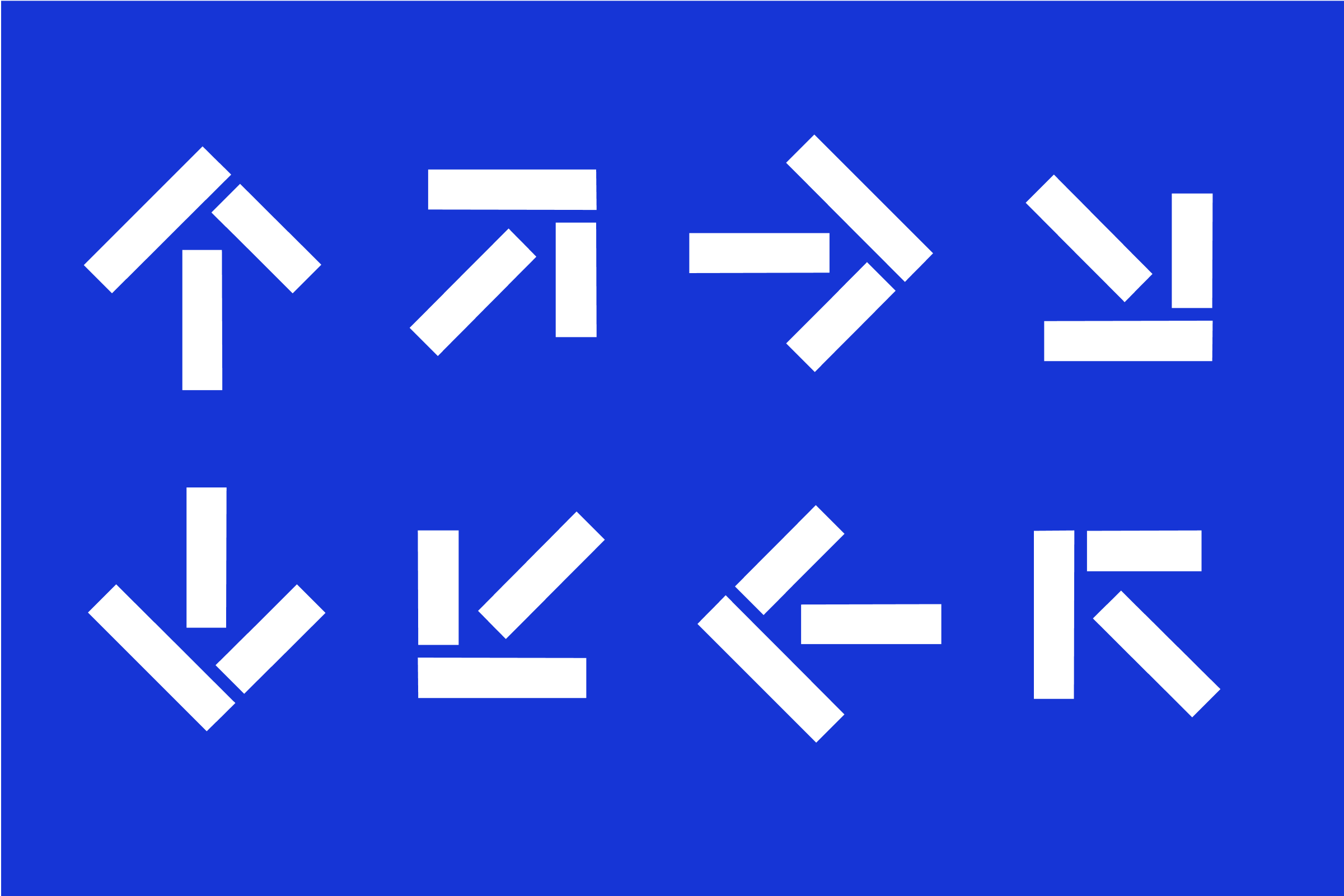
Arrows are part of the font (↑ ↗ → ↘ ↓ ↙ ← ↖) and can be used as navigation icons.
Updated 2025/06/17


Navy Blue (Primary colour)
#1635D6
R: 22 G: 53 B: 214
C: 100 M: 91 Y: 0 K: 0
Pantone BLUE 072

Light Blue
#69BCF9
R: 105 G: 188 B: 249
C: 62 M: 10 Y: 0 K: 0
Pantone 2915

Yellow
#FF9900
R: 255 G: 153 B: 0
C:0 M:29 Y:89 K:0
Pantone 142

Pink
#F08FF2
R: 240 G: 143 B: 242
C: 6 M: 55 Y: 0 K: 0
Pantone 237

Light Green
#00B47E
R: 0 G: 180 B: 126
C: 78 M: 0 Y: 69 K: 0
Pantone 2416

Darkgreen
#005545
R: 0 G: 85 B: 69
C: 83 M: 26 Y: 55 K: 61
Pantone 627

Dark pink
#870352
R: 135 G: 3 B: 82
C: 16 M: 100 Y: 11 K: 43
Pantone 228

Dark red
#BF0404
R: 191 G: 4 B: 4
C:2 M:98 Y:85 K:7
Pantone 1797

Violet
#5F0096
R: 95 G: 0 B: 150
C:72 M:100 Y:0 K:0
Pantone 2603

Light Purple
#9a83fc
R: 154 G: 131 B: 252
C:40 M:40 Y:0 K:0
Pantone 2705
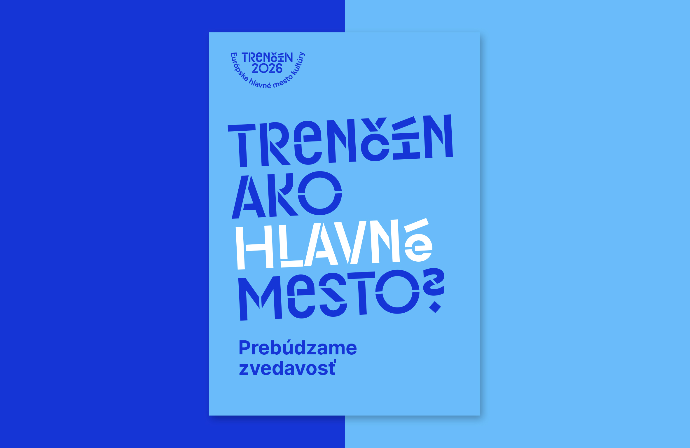
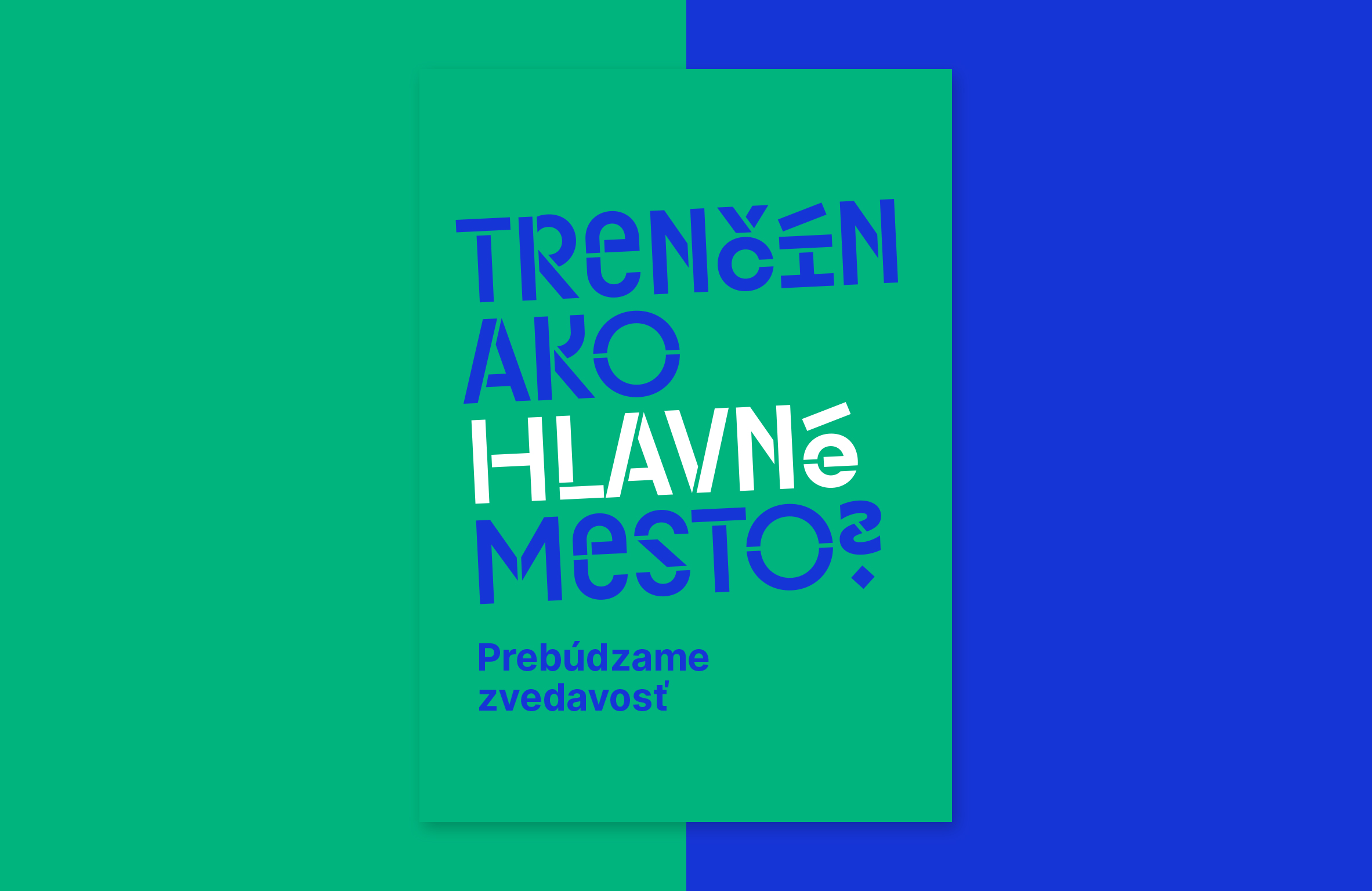
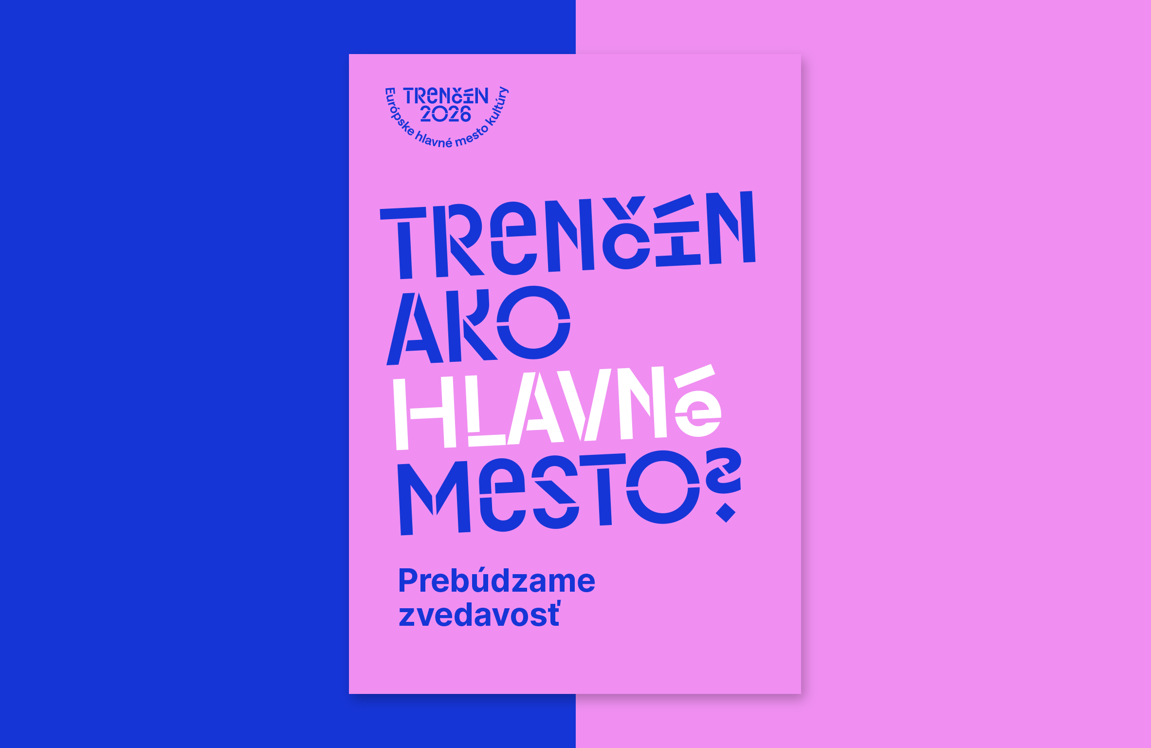
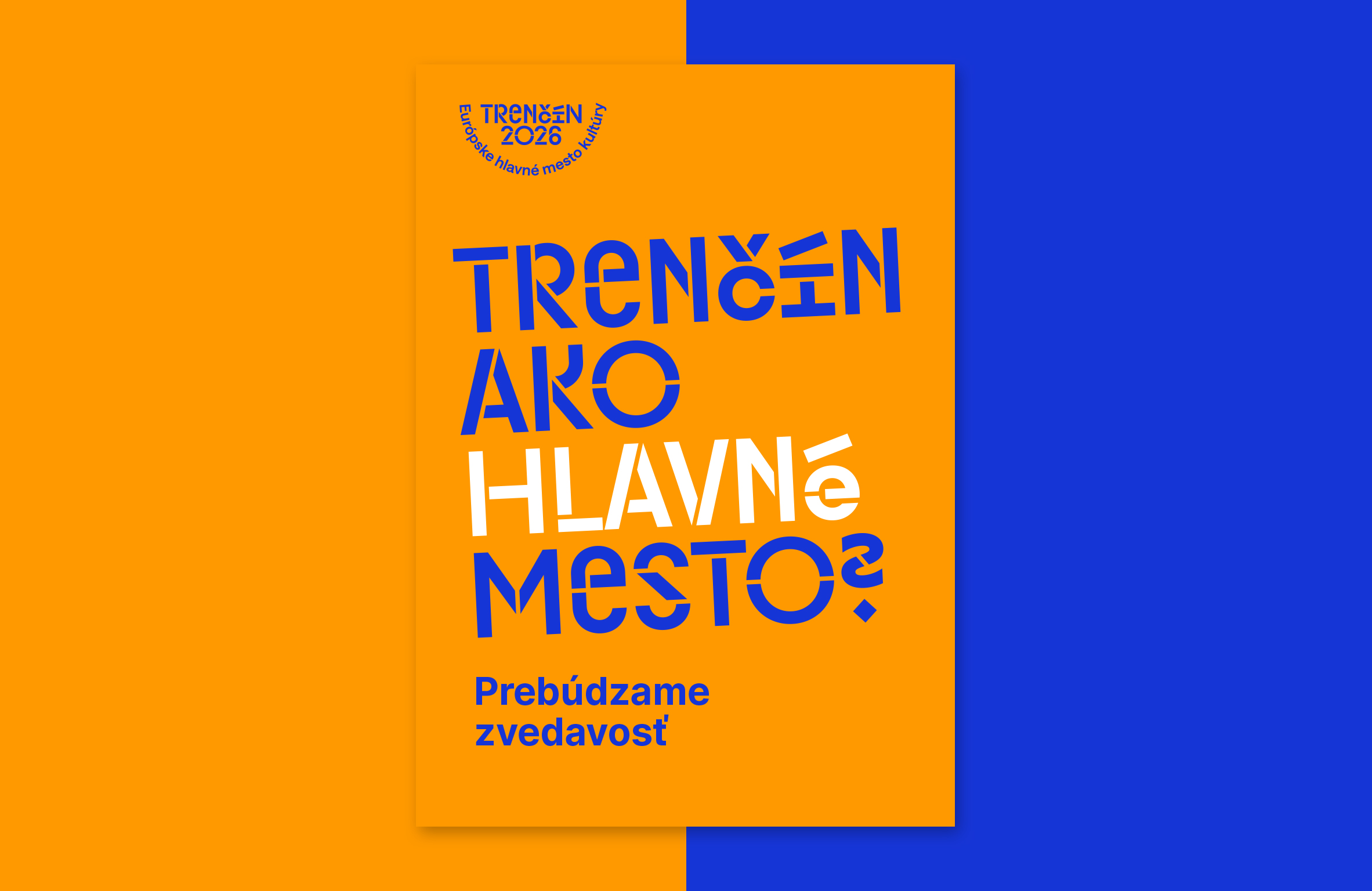
Accessibility in our designs ensures that our outputs are inclusive, useful to all, including people with visual impairments. Colour contrast is also a key aspect of accessibility. This manual provides guidance on ensuring that colour contrast meets WCAG 2.0 standards.
Pri vytváraní dizajnov je dôležité dbať na dostatočný farebný kontrast tak vieme zaručiť, že text bude rozpoznatelný a odlíšiteľný.
Updated 2024/04/05
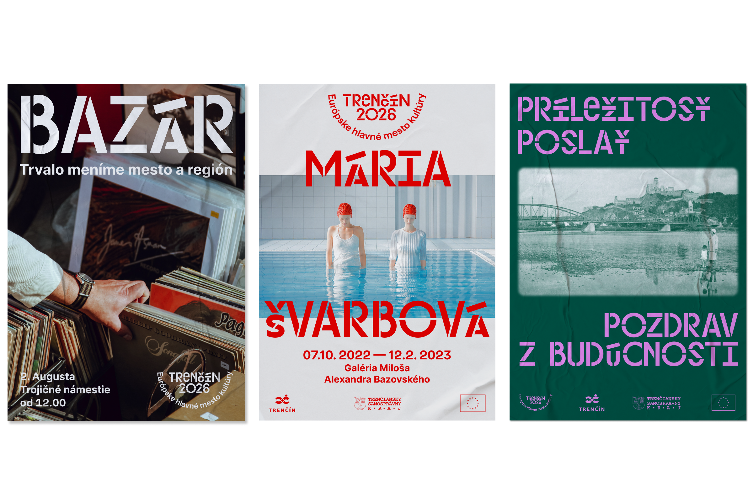
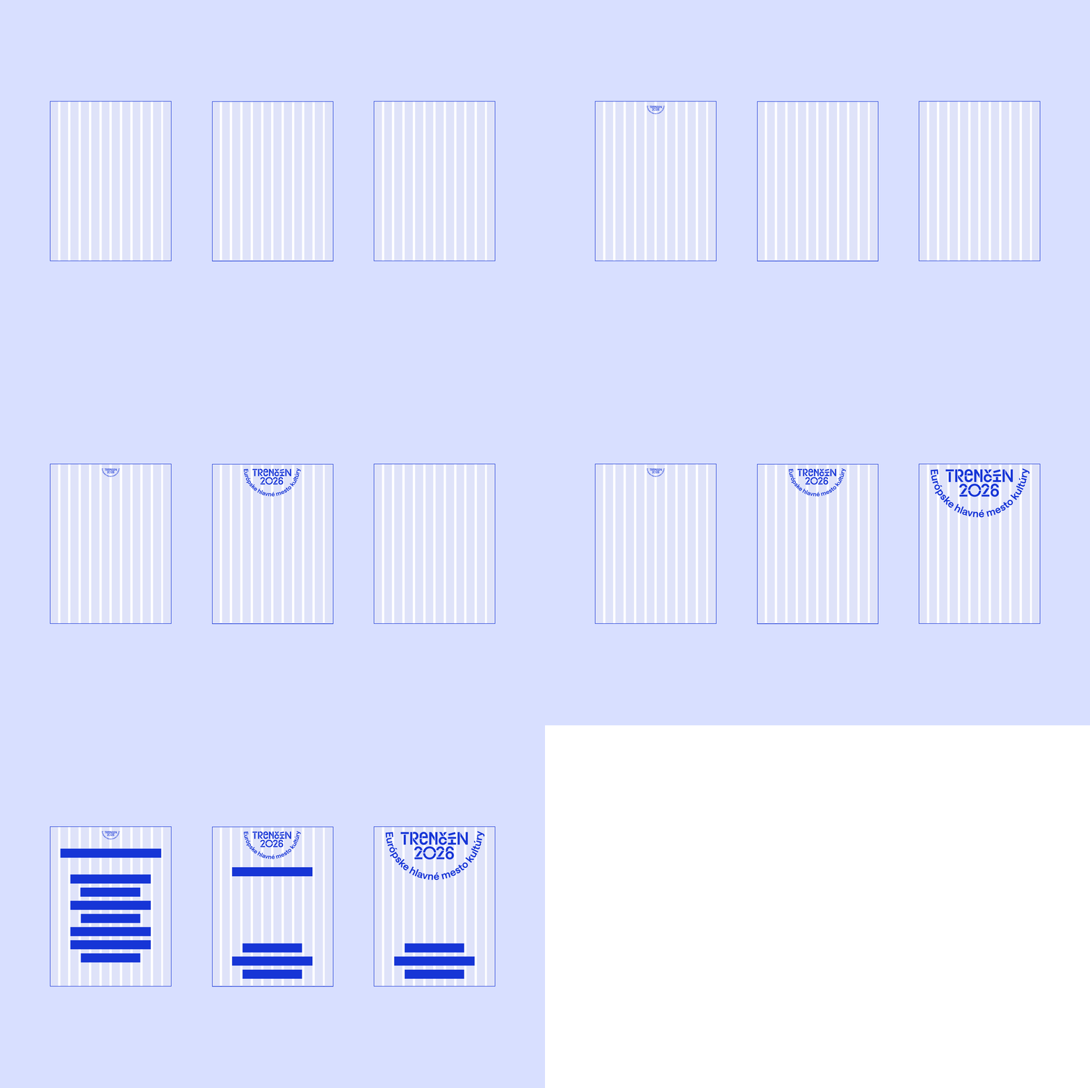
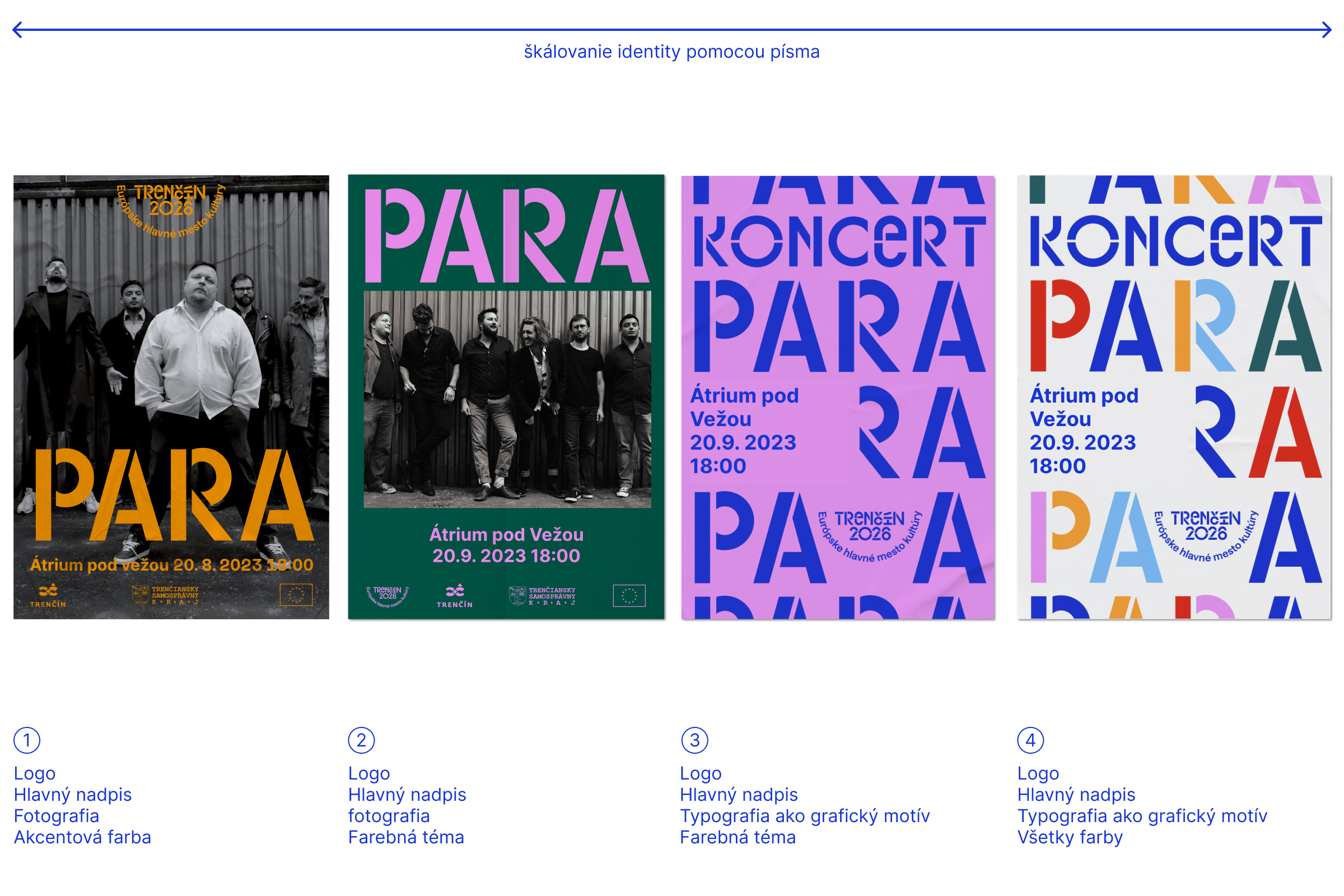
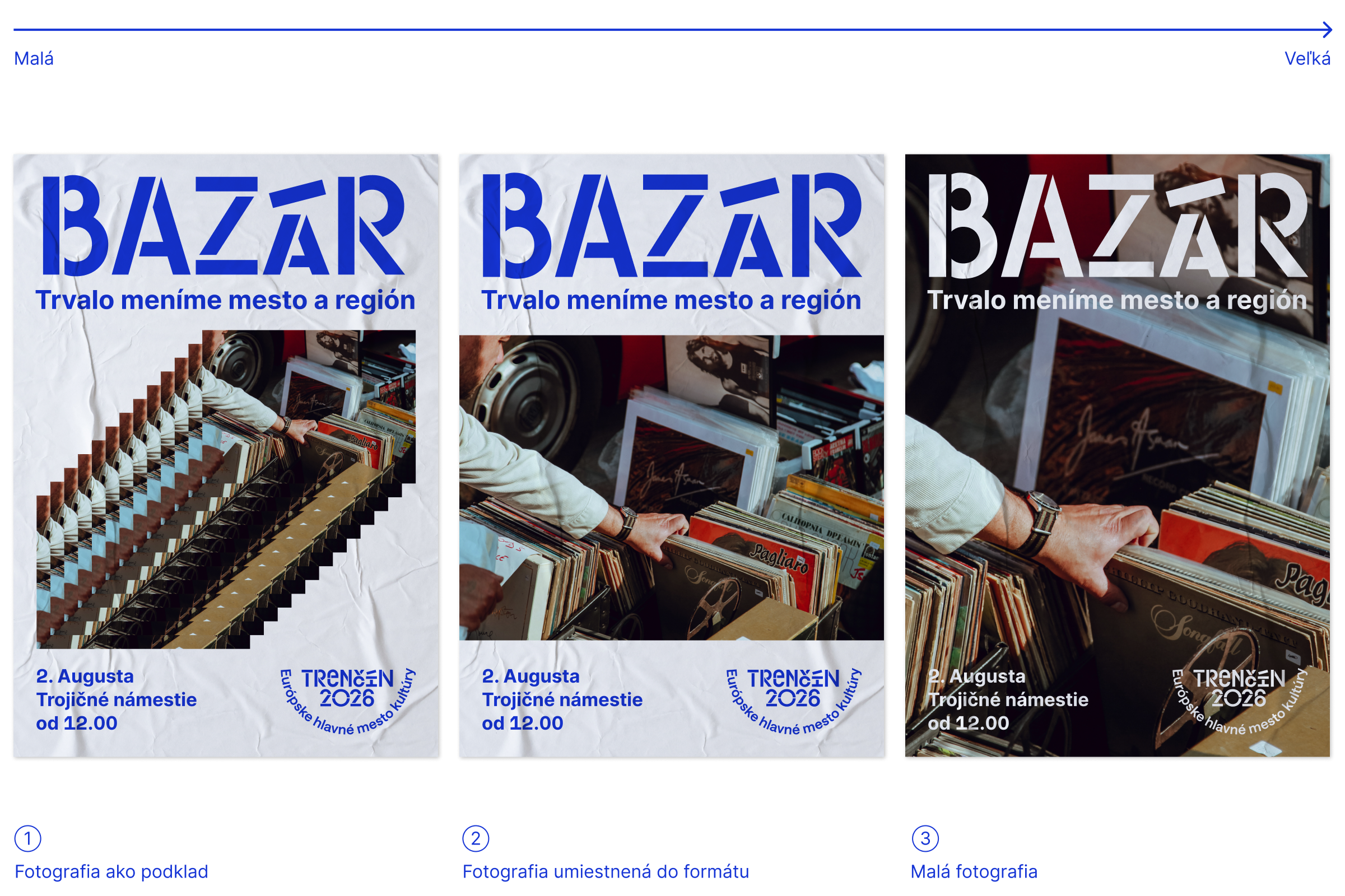
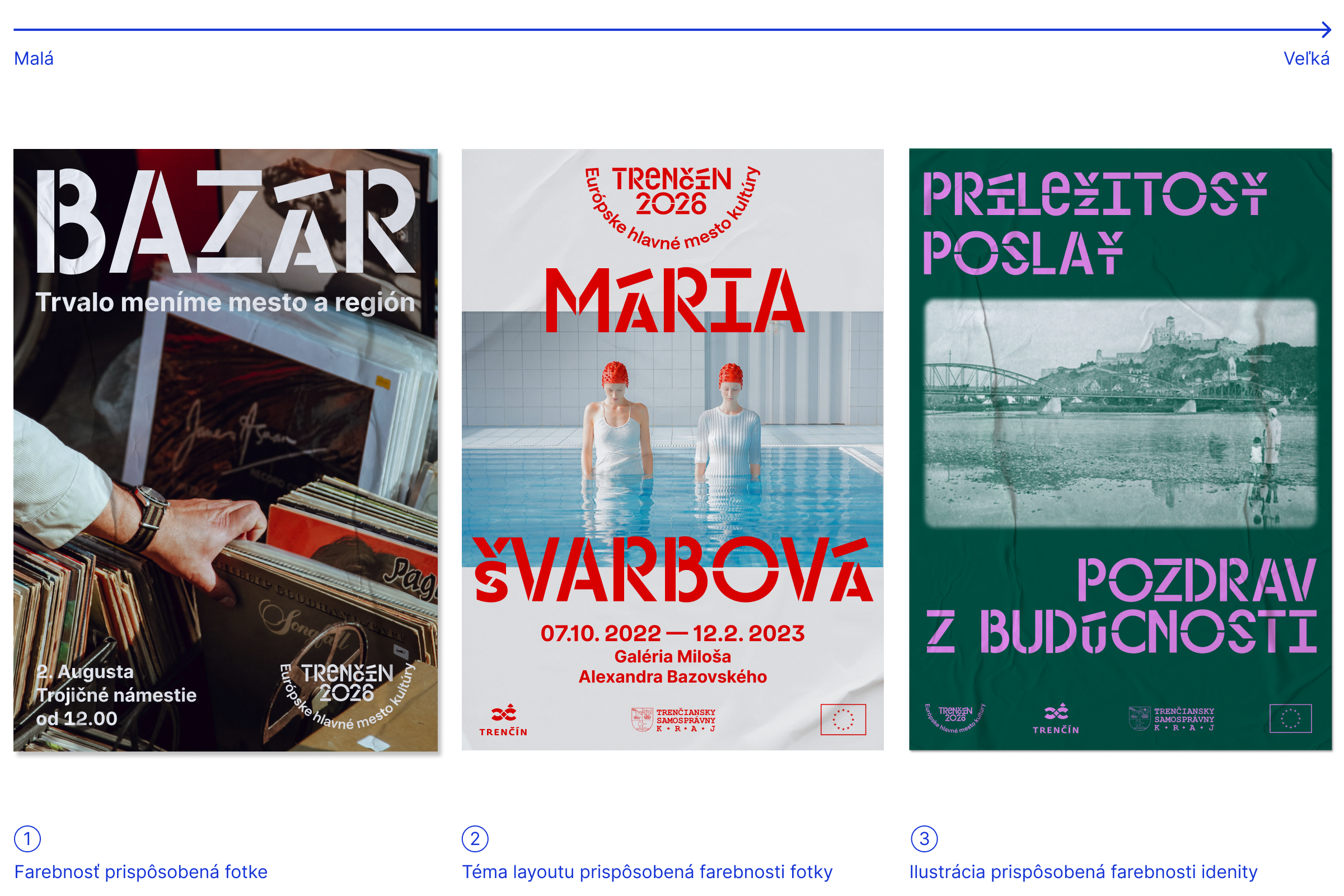
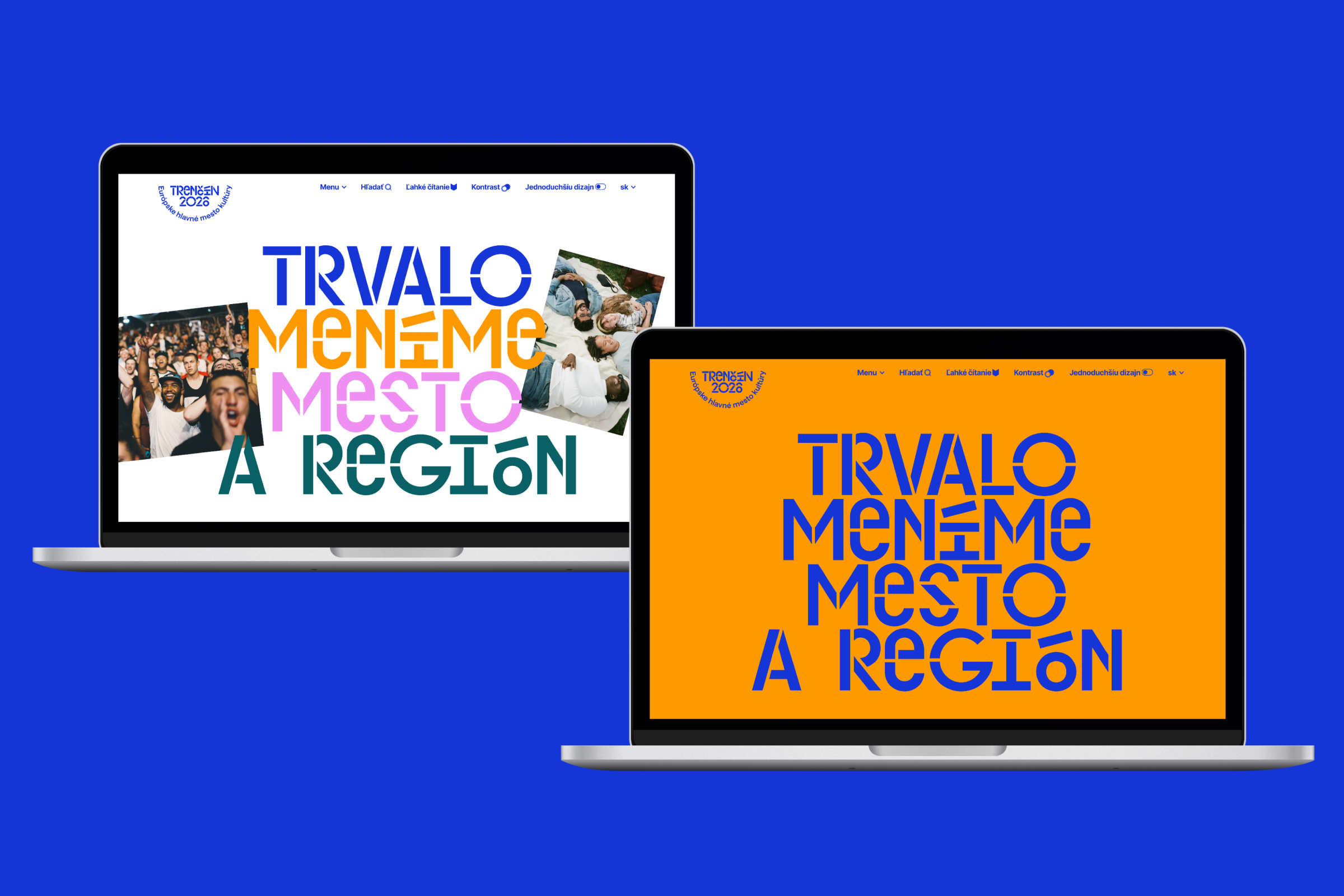
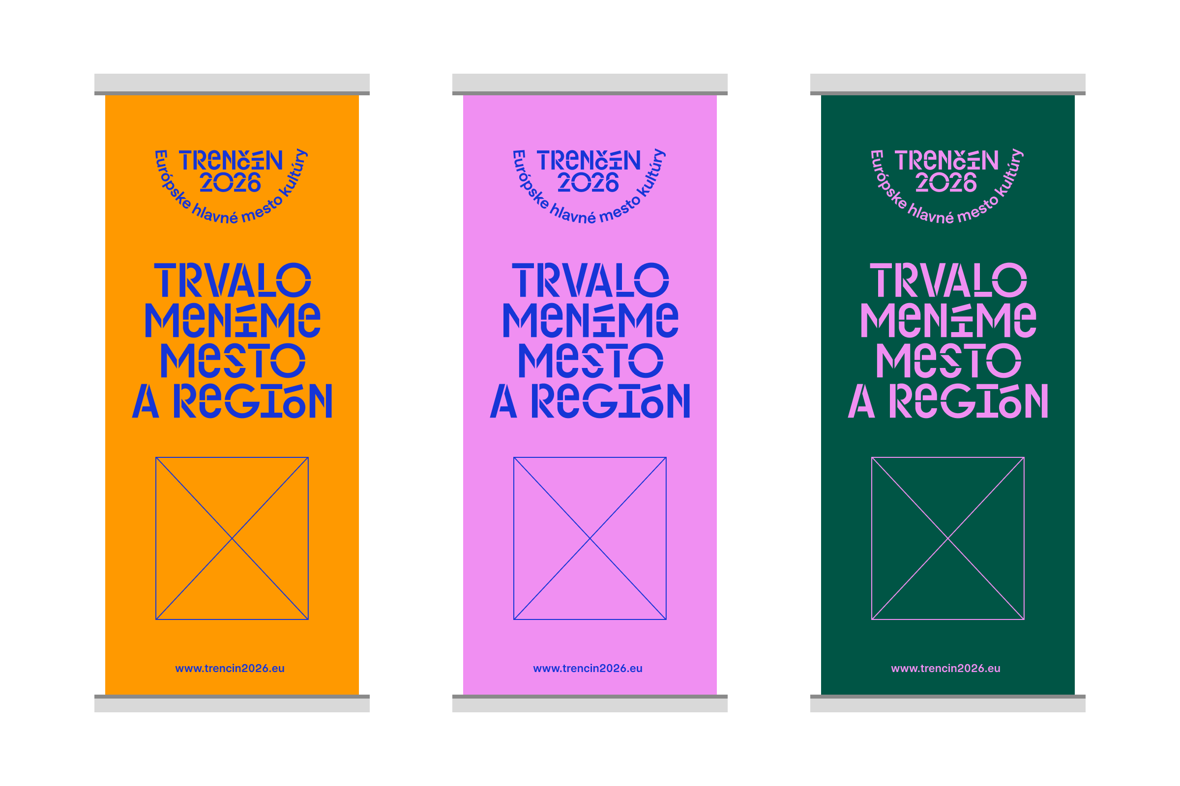
There are two ways to create layouts with visuals under the brand of the ECOC Trenčín 2026: typographic or using imagery: with illustration or photography. In combination, they create space for several ways of communication. The basic elements of the brand offer the following layout treatment:
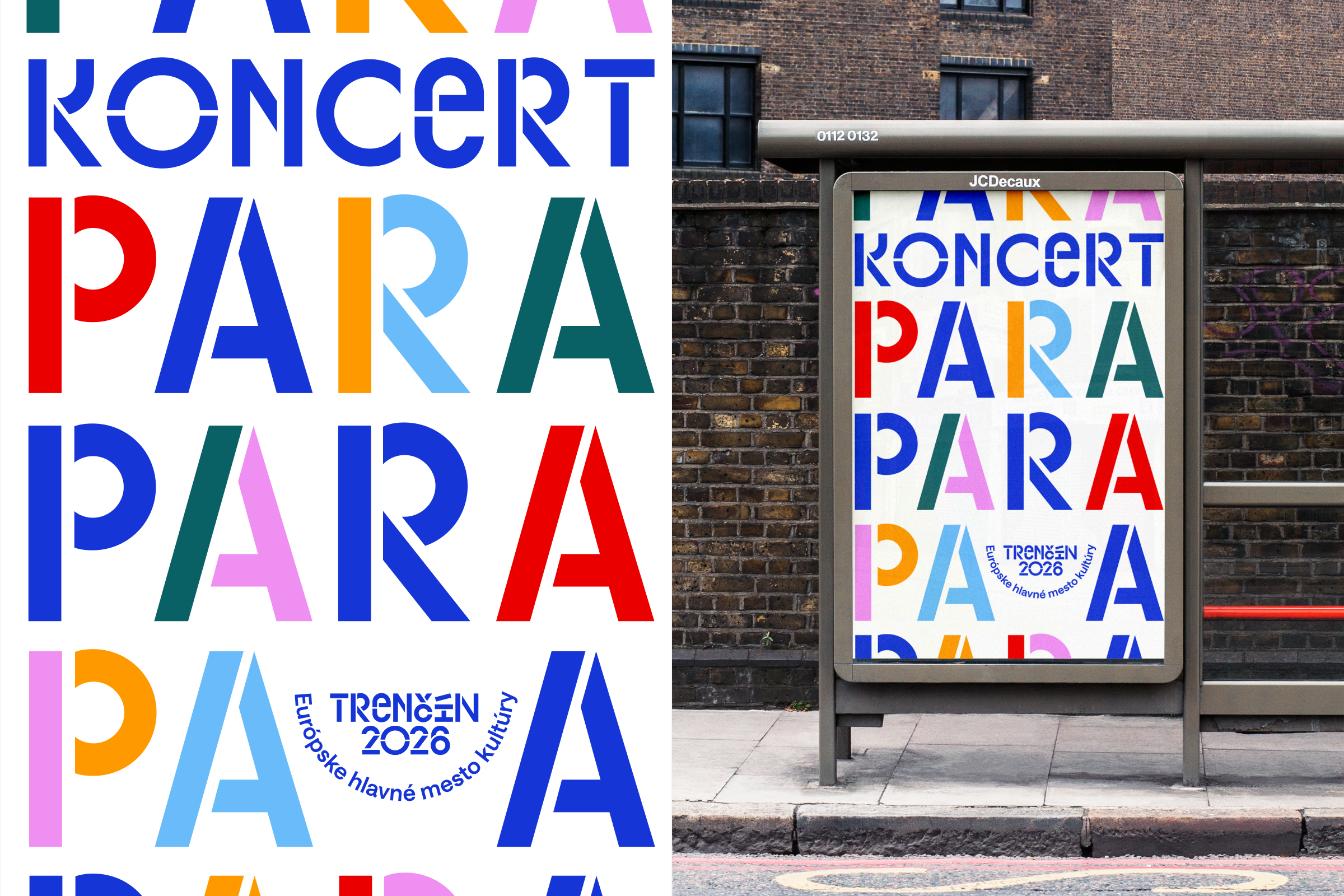
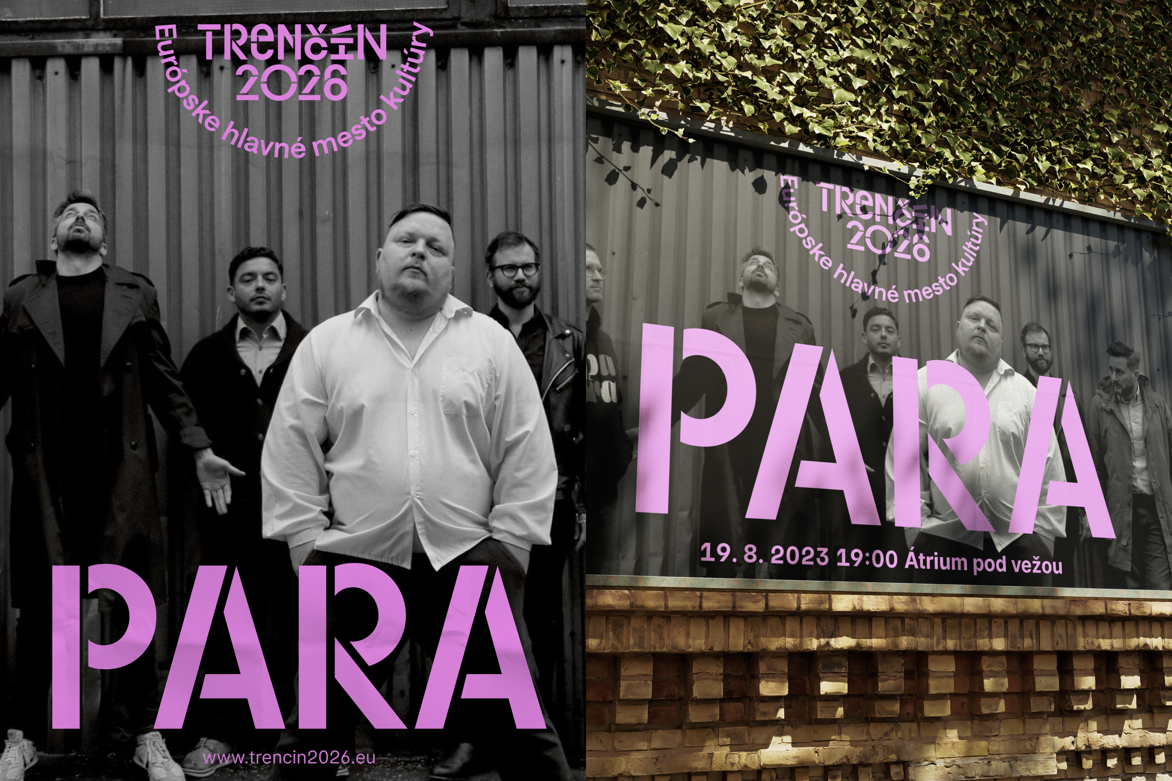
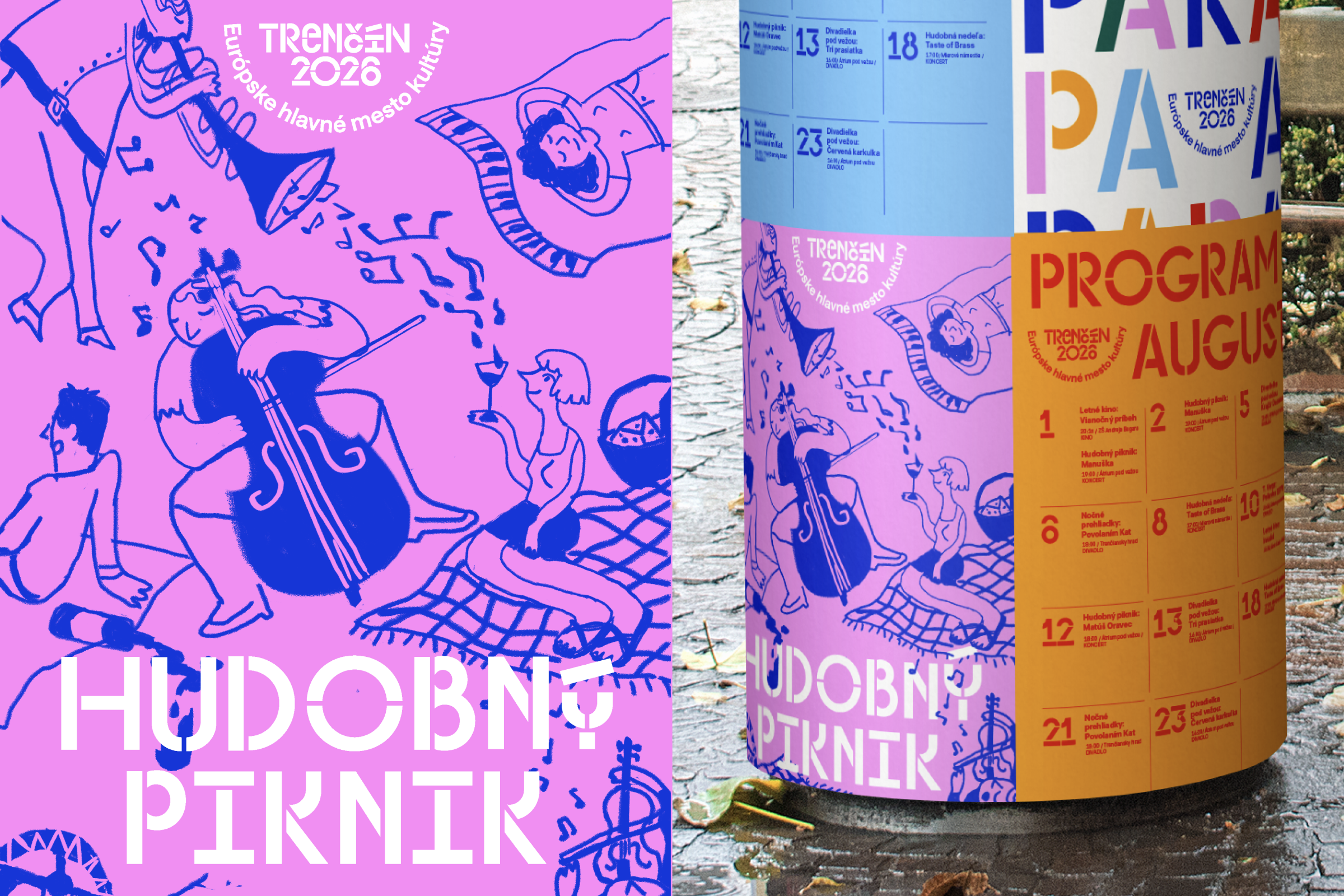

We know how to work with the title tag font
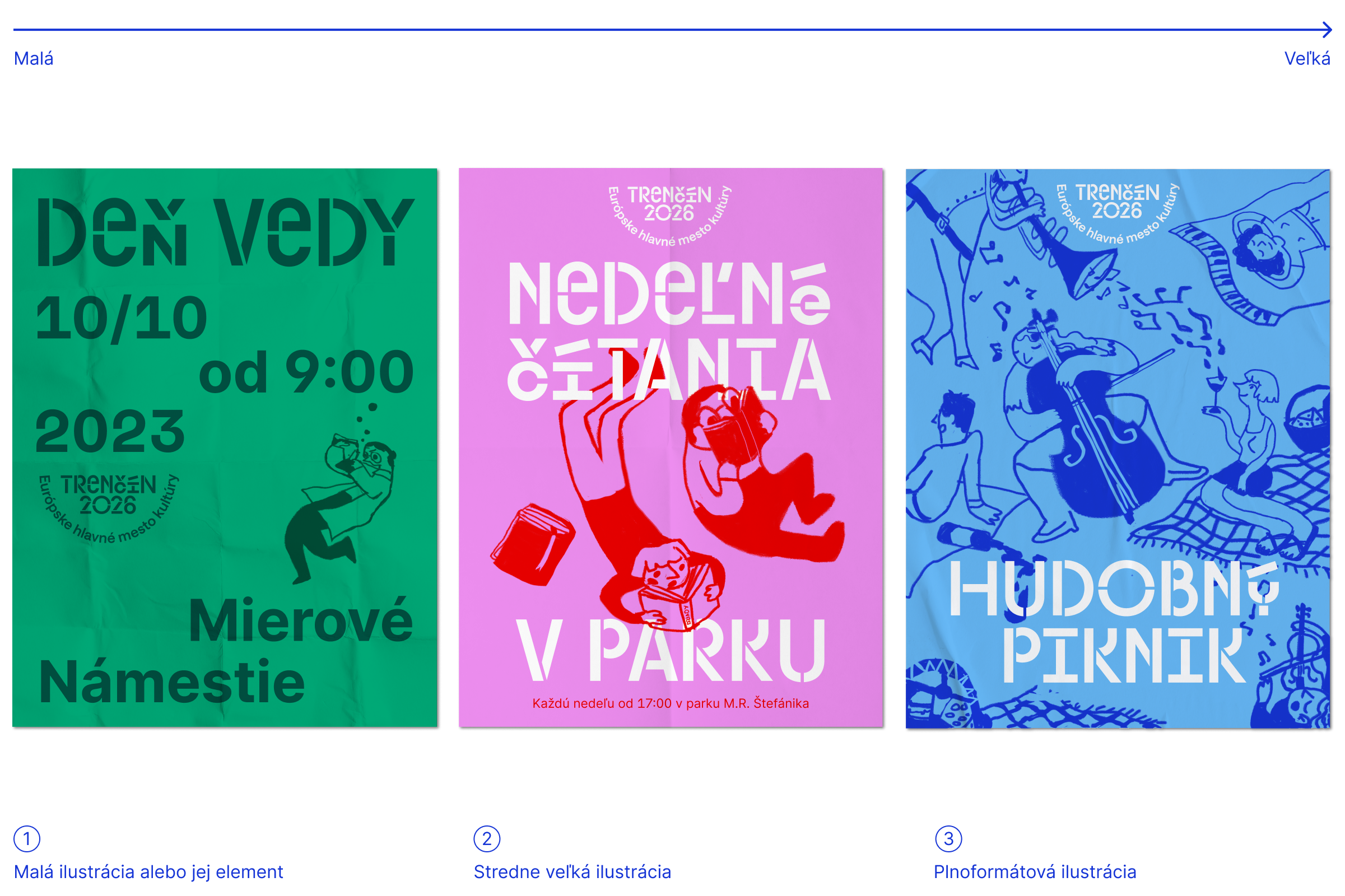
Working with illustration allows us to work with a small illustration or a fragment of an illustration, a larger illustration incorporated into a layout and a full-size illustration.
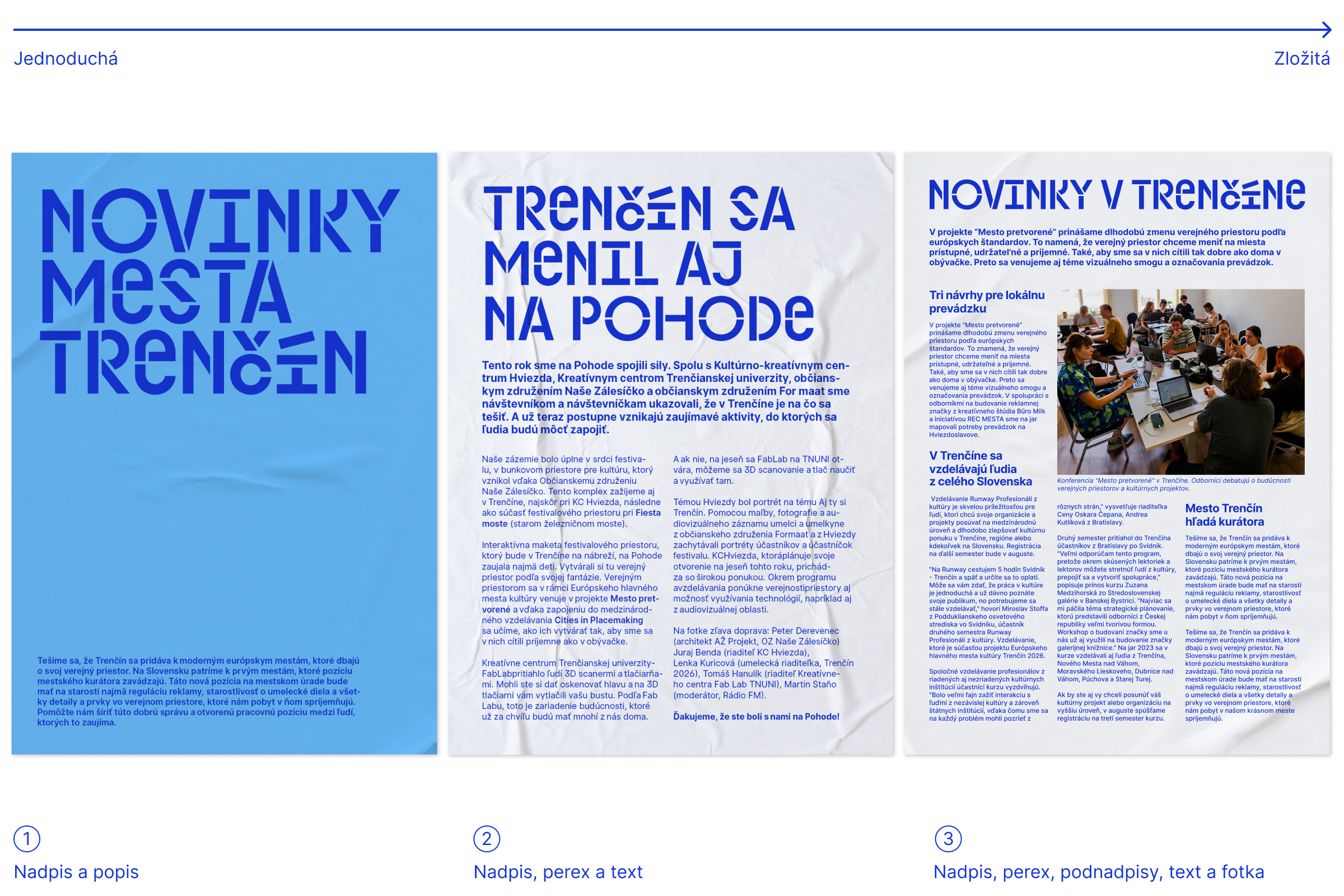
Depending on the complexity of the layouts, we scale the amount and size of the brand headline font.
The minimum size of the layout margins is identical to the logo protection zone.
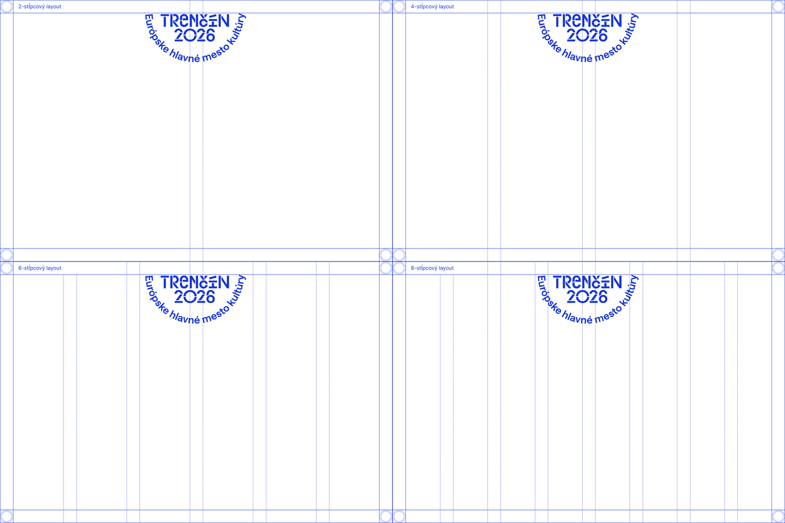
In layouts we work with even numbers of 2, 4, 6, 8, 12-columns.
Updated 2024/04/05
Updated 2026/04/15
Elements of Visual Identity
For Partners
Partners’ Logo